Before we discuss The Octavius Tower at Caesars, let’s talk architecture. The concrete and glass forms of IM Pei. The explanatory structural simplicity of Mies van der Rohe’s creations. This marriage of simple, pure, useful design and comfortability has been what is driving this whitewashing of Vegas.
MGM’s using it obscenely, both before and after Aria, their modern masterpiece. And yet we yearn for it if even the purity is elaborately ensconced in the creations of Roger Thomas and Todd Avery Lenahan. We all drink the Kool-Aid. We thirst for it.
But Vegas wasn’t built on architectural theory. It was built on the over the top gaudy stage scenery that makes you a part of the show. Jay Sarno knew this when he built his Palace. A place where every man (and woman…it is the 90s right?) can be a Caesar. The ideal was pure, but years of expansion and changing hands have turned this empire into a hodgepodge on a colossal scale.
Much like the bossman mentioned in his recent review, I too was stringently anti-Caesars for a multitude of reasons, but a series of colossal fuck-ups by every hotel under the sun left me looking for something new.
So, when a comp for the new boutique-touted Octavius Tower at Caesars came up on my Caesars Rewards Loyalty Program (formerly Total Rewards) roster, I thought “Hey it can’t get much worse than what I’ve been dealing with, can it?” Off I went, on a wing and a prayer, into the old yet new frontier.
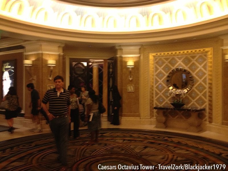
One of the first things that completely tossed me into a new world when I arrived at Caesars is that, like Augustus Tower patrons, those in Octavius are asked to Valet at the Augustus Tower VIP Valet, a totally separate area off Flamingo across from the Bellagio north valet.
This lets you completely avoid the chaos of Caesars main valet and entrance off the Boulevard. Paired with the fact that the Diamond Registration and Lounge are paired just inside these doors, and you’re already sequestered from what can be at times a jammed casino just a football field’s distance away. The effect is transformational and honestly quite serene.
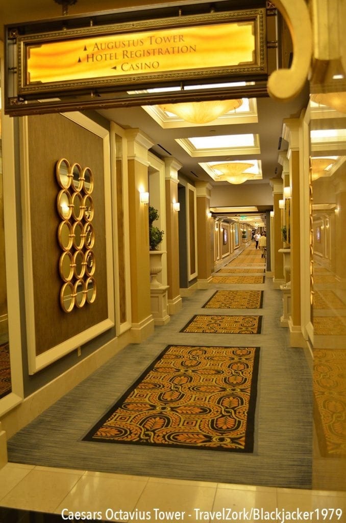
Once checked in, you are directed even further away from the hustle and bustle to the Octavius elevators, all the way realizing a subtle change in decoration in moving through the different layers and towers of Caesars. Light colors and modernity in Augustus slowly meld to more bold colors, golds, and patterns when you reach the guard before Octavius. It’s over the top, but remarkably restrained.
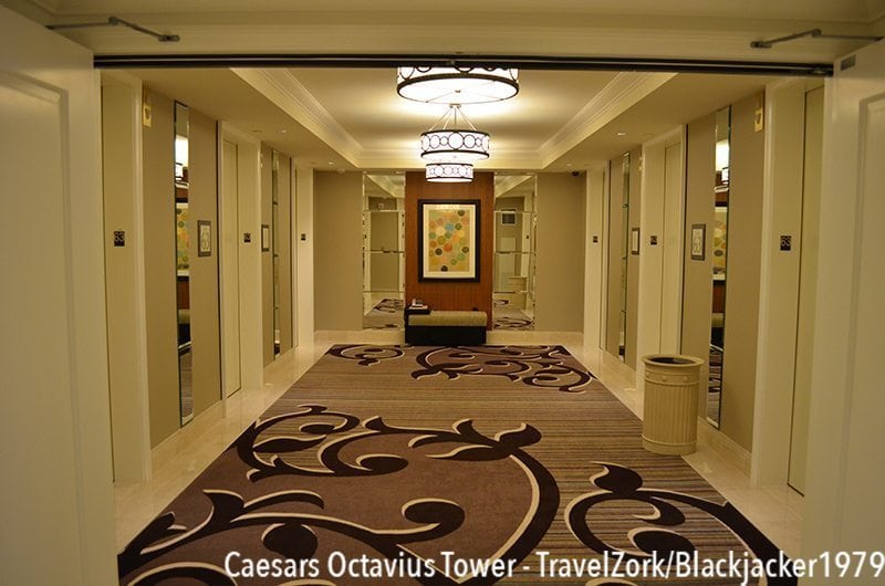
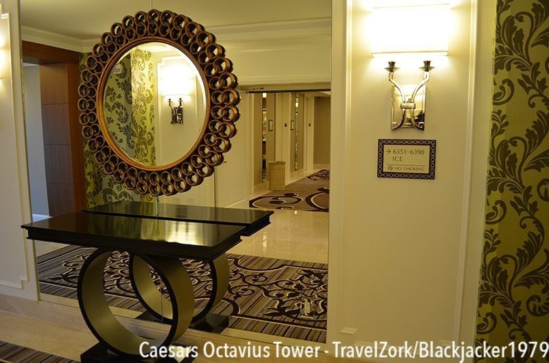
Arriving on my floor, the first thing I’m struck by is the absence of Caesars. Yes, there’s a single waste bin that looks like a column, but otherwise the moldings have been replaced by light chrome light fixtures with playful patterns, and a delightful striped carpet with a vine theme. Colors are muted but not over the top, totally comfortable. The only trace of heavy elements left are the mirrors which are in a stone pattern, giving the heft without the weight. A lovely table and mirror accent the circle theme on the opposite end of the vestibule.
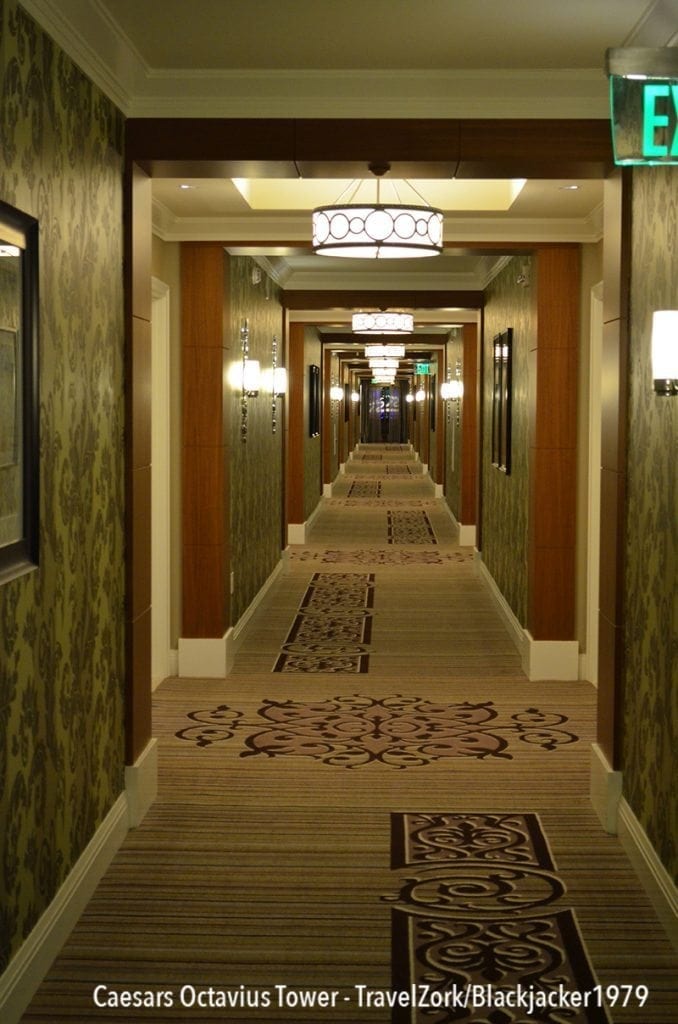
Moving towards the room is simple, as the entire tower is one long linear hallway with the elevators at the eastern end. There’s a lovely play of asymmetry, with carpet and lights changing sides with framed prints between each set of rooms. The carpet, lights, and wallpaper continue to carry the same bold color scheme, with curvilinear patterns in bold greens and purples with wood accents.
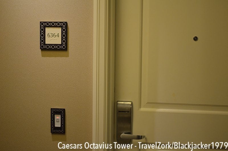
Arriving at room 6364, the theme continues. In the door number sign, as well as the DND/Doorbell switch plate, the circle pattern is copied. This intentional regard to making sure there is cohesion is a welcome thing, especially after some of random room designs we’ve all been forced to see recently. Insert the room key and…
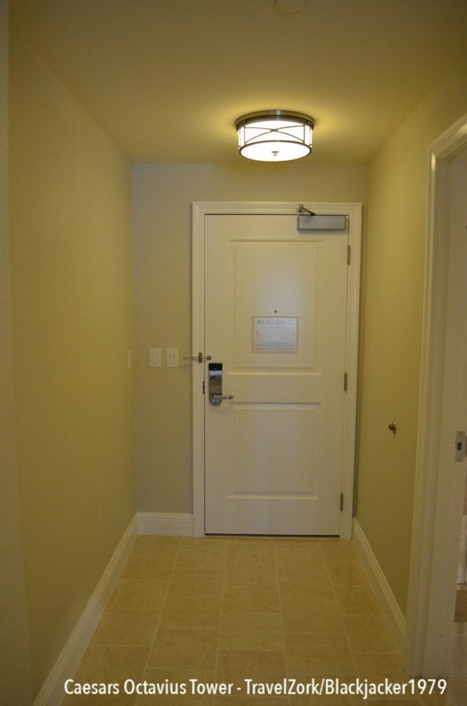
One step inside of the large hallway and you’re immediately reminded of the size of the Augustus tower rooms, however the space seems to be used a bit more smartly, with more space to maneuver luggage into the room similar to the Encore and Wynn rooms. While color schemes are muted, the light picks up the X brace theme found throughout Caesars nicely, while the marble tile in a stacked brick pattern was spotlessly clean. Adjacent to the door are controls for the lights, as well as for the DND and Housekeeping lights, exactly like those at Encore.
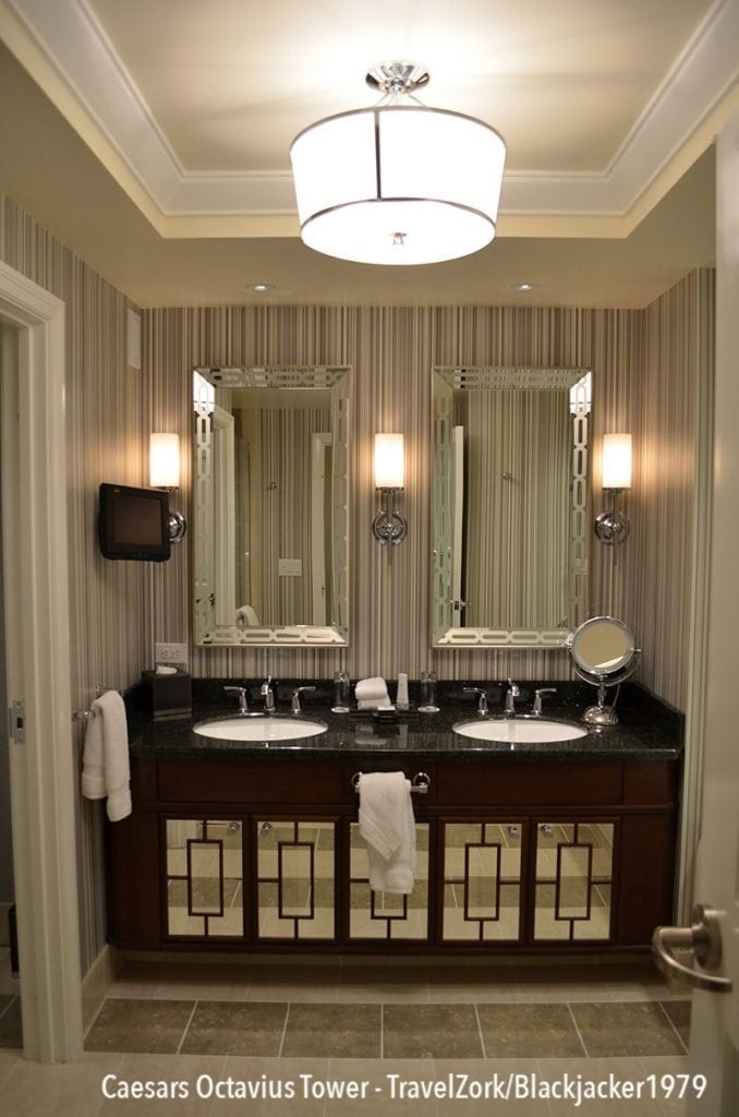
Just to the left is the bathroom. Inside is a gorgeous double vanity, topped with black granite and a dark cabinet with mirrored doors underneath and etched mirrors above. Again the play on a theme comes into a play, with classic Caesars design elements thrown in a more bold presentation, from the wood detail on the cabinet (some of which was missing in my room) to the mirror etching and the sconces around the vanity. Also included is a small LCD TV for watching when you’re indisposed.
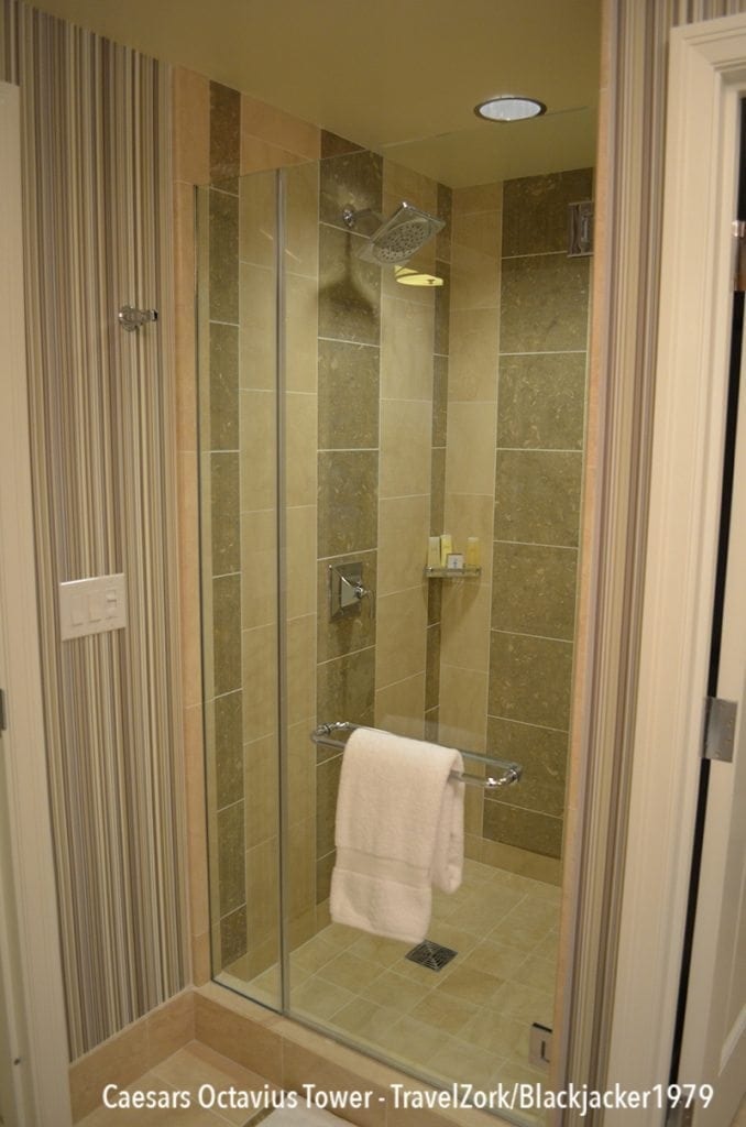
Immediately to the left is a stand up shower stall with rain-style head. The tile in the bath picks up the same pattern, however with a light and dark striation of tiles which, while interesting, seems to not really work well with the bright striped wallpaper chosen. Shower pressure is ample and hot water aplenty.
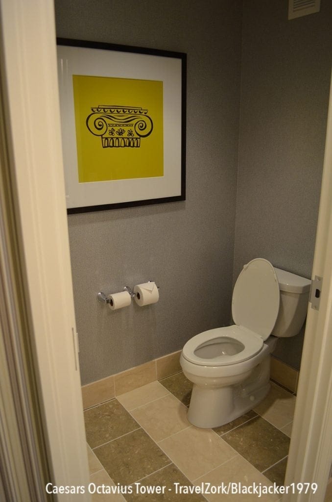
Next door is an enclosed WC, with a high rider and plenty of neatly folded TP. No shatphones here…maybe people have realized in the age of cordless/cellular phones they are no longer needed.
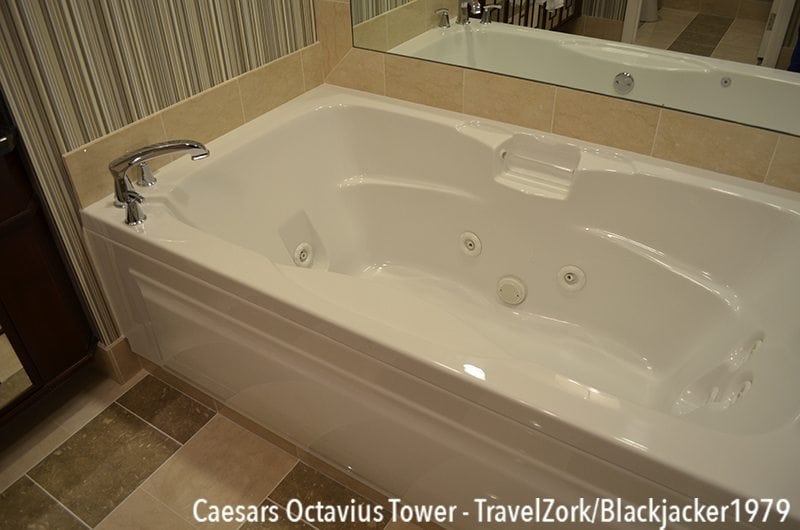
On the opposite side of the room is a large spa tub with jets. The tub is ample deep for all sizes, and fills quickly with hot hot hot water for your use. I took advantage of this several times throughout the stay and it came to be one of my favorite things about the room. With the spotless housekeeping and ample goodies kept stocked by the housekeeper, I longed to take the whole thing home with me when I left.
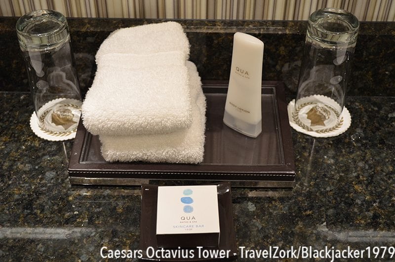
As with all other rooms here, the products provided are Qua and they are amply nice to use. Nothing fancy, but the right thing for what’s needed.
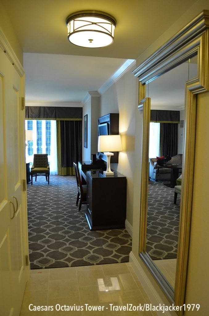
Moving out of the bathroom and towards the main room, there’s a short length of hallway with a lovely floor mirror that’s been modified to look like an abstracted column with molding. An interesting way to carry the theme, just as we’ve seen before. Across from that is a double doored closet.
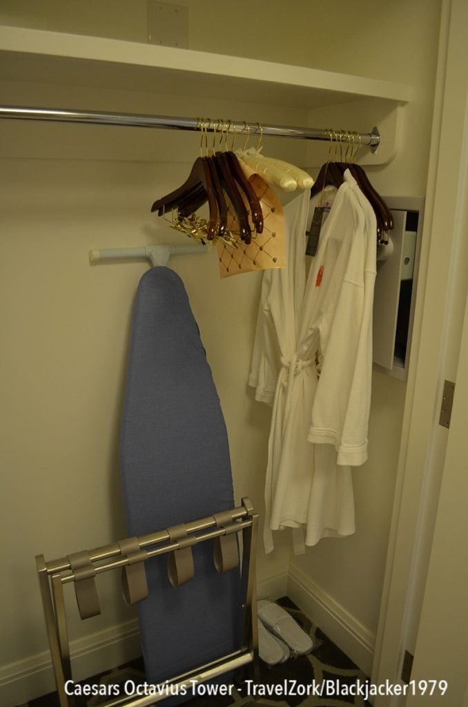
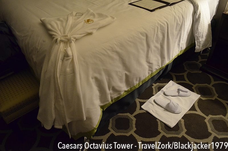
Inside the closet is the usual assortment of goodies including ironing board and iron, luggage rack, robes, and an in wall safe large enough for a laptop, iPad, and more. Just beyond that is the room.
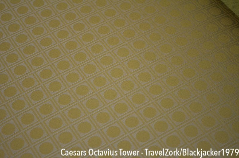
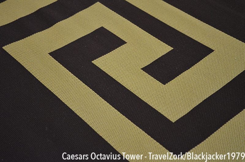
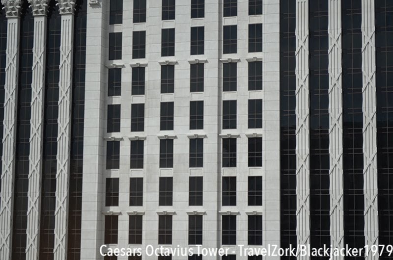
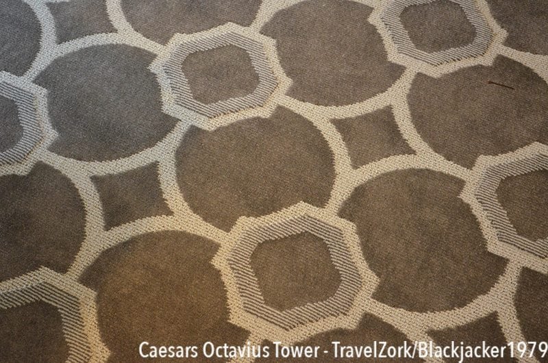
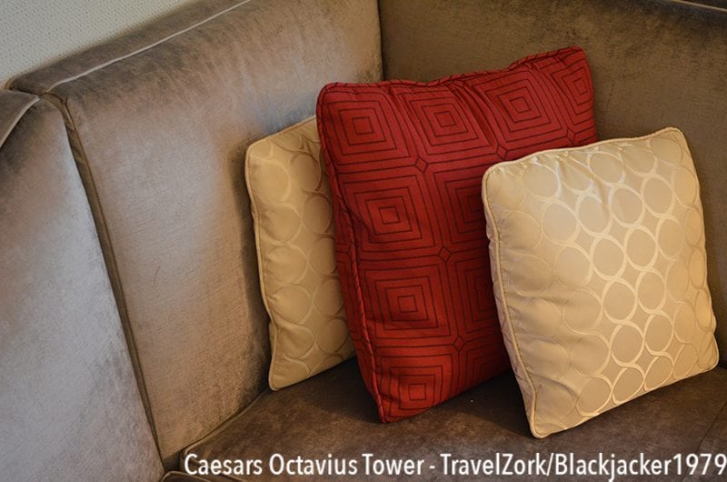
The first thing you notice when you enter the main space is that there are a load of patterns and textures at work. From the simple and bold to the more delicate and complex, everything is bright, bold, and colorful, yet not overwhelming to the eye. And all of it, from the carpet to the cushions to the wall art throw back to a variation on the classic Caesars theme.
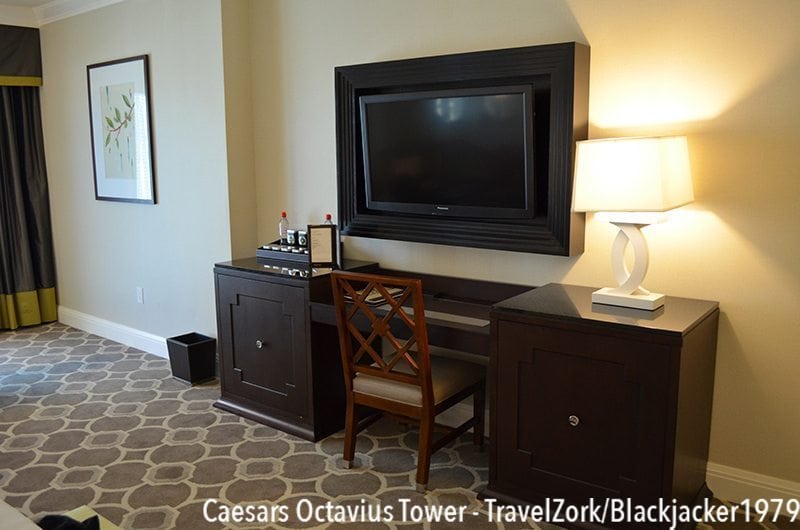
To the right in the room is an entertainment center and desk combo. At the bottom, two large chests combine with a desk between in dark wood, with accents reminiscent of column frames. The right chest contains drawers for storage, with a granite top and fantastic cross based white lamp. In the middle is a glass topped desk and work area, above which is a flat screen TV in a large wooden frame, giving it a bit of a dress up that’s nicer than just a simple wall mount. To the left is the mini-bar in the chest, with more items for sale on top.
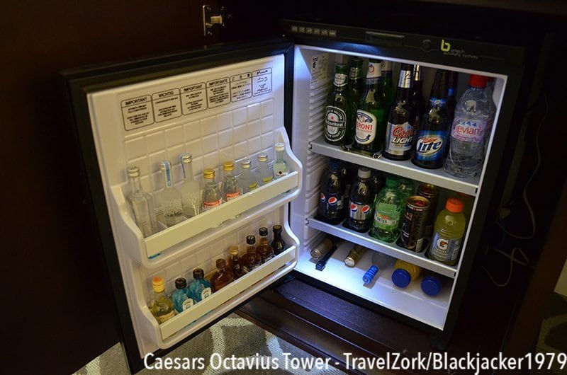
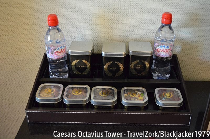
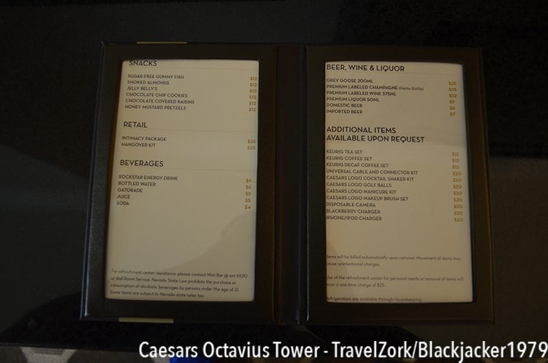
The mini bar contains a nice assortment of your standard beer, along with Belvedere, Absolute, Bacardi, Bombay Sapphire, and Jack Daniels. Drink products are Pepsi, and as usual you can find an intimacy kit and the usual snack assortment. Prices are high, but not as high as Wynn or Aria.
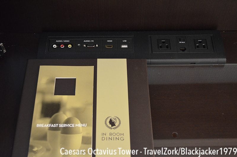

A nice feature on top of the desk is a connectivity panel which features USB ports, power outlets, and a dedicated iDevice connector. As demonstrated, this allows you to connect your iPhone or iPad to the TV system, and through a menu playback on the big screen. I was able to use the connection (with adapter) to stream Netflix directly to my TV, avoiding the pitfalls of disappointing hotel channel lineups.
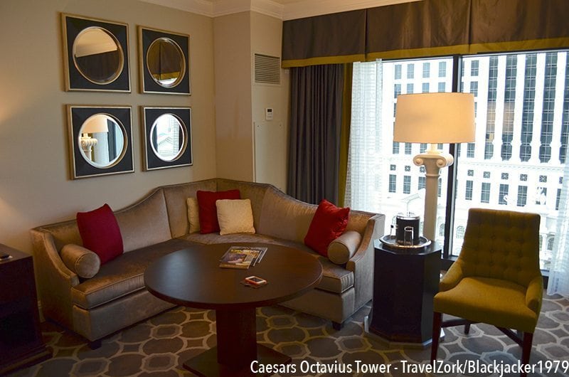
Across the room is a sitting area for entertaining and hanging out, or in room dining. There’s an L-shaped sofa in a light soft shimmery fabric, decorated with pillows in red and cream with the same circle pattern found throughout the halls. In the middle is a round topped table which make the whole area serve as both regular seating and a banquette with table for those wanting to dine in room. Mirrors behind the couch help add size to the space without being as dominating as a full wall mirror. Next to the couch is a green high back chair which picks up the same color as the border on the drapes behind, in a soft green fabric. Between the two is a great themes column floor lamp and a small octagon table with an ice bucket and glassware for entertaining. Perfect! Also in the picture is the AC unit, which is thankfully not motion based.
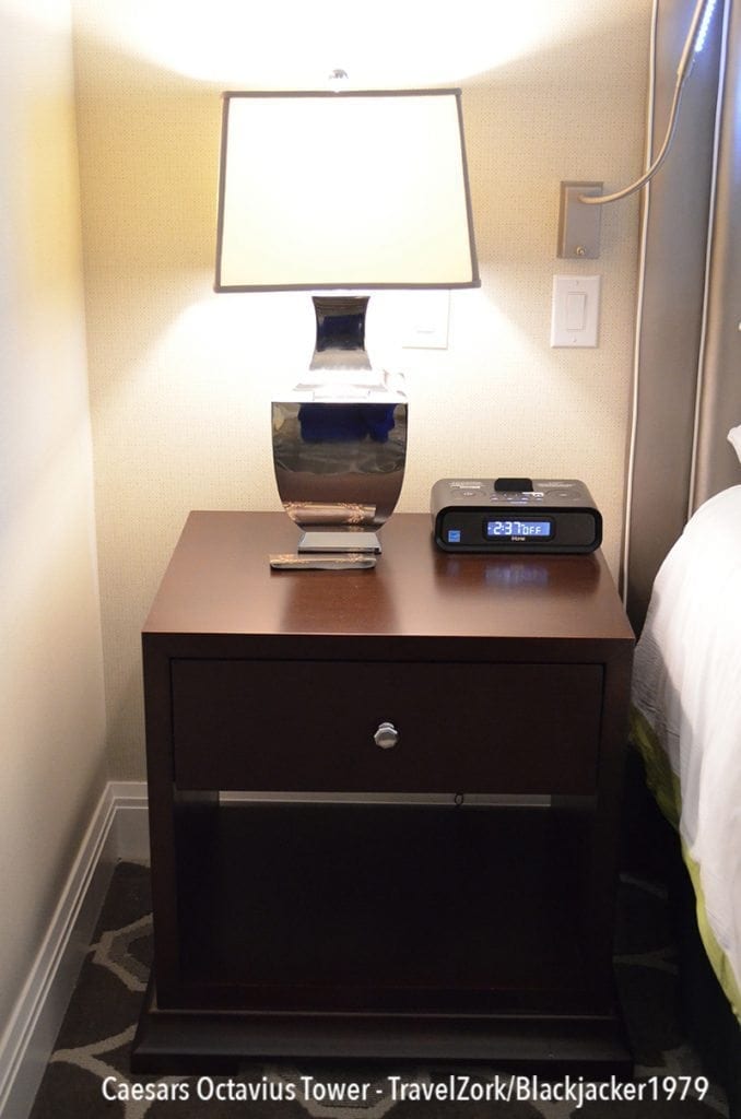
To the left of the bed, the first nightstand is utilitarian and perfectly useful, with a lovely box shaded urn styled lamp in silver and an iHome radio.
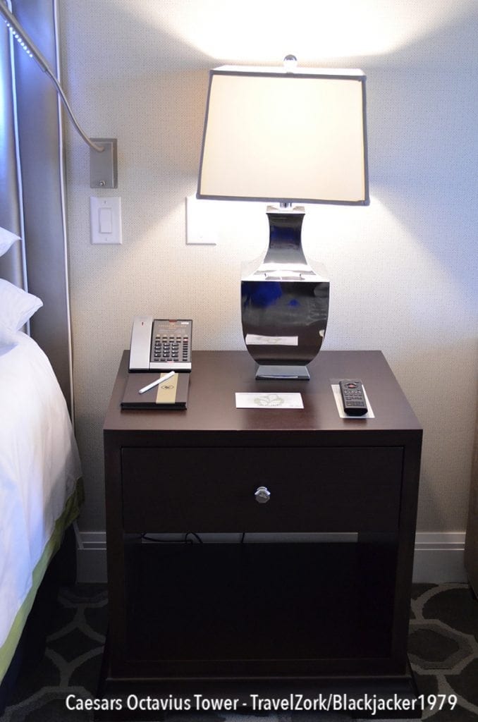
To the right, the other nightstand holds a slimline cordless phone, remote control, and memo pad in addition to the lamp. The remote is the same system as Aria uses, Control 4, although with a bit more polish and theming. Light controls are also aplenty next to the bed.
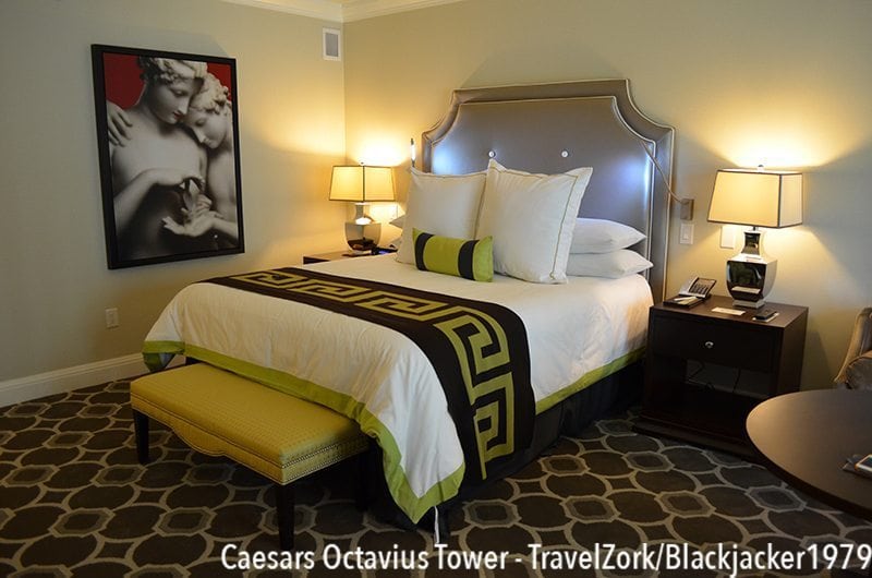
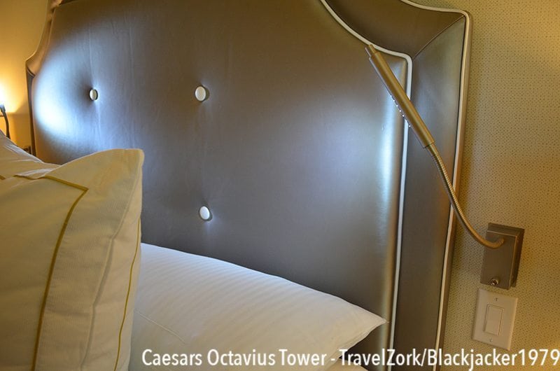
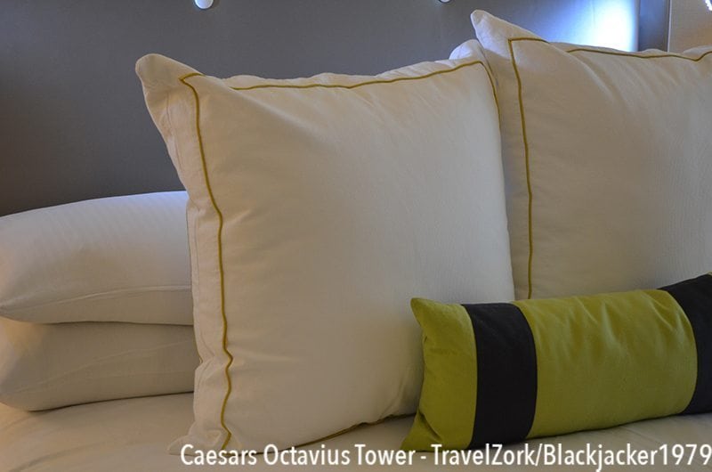
Completing the room is the bed, a gorgeous assemblage of theme and comfort. The headboard is a classic shape, with a shimmery light silver fabric and white piping. Linens on the bed accent the room in white and bright green, with a green bolster, and a greek key throw in brown and green as well. There are an abundance of pillows, and although a bit hot the bed is extremely soft to sleep on. At the base of the bed is a green bench for putting on shoes of storing goods, and also added are LED reading lights, a nice touch for those who like to read in bed. The art adds the classical touch, with a bit more sass, and my sleep here didn’t disappoint adding to what can only be said was an attitude-altering stay.
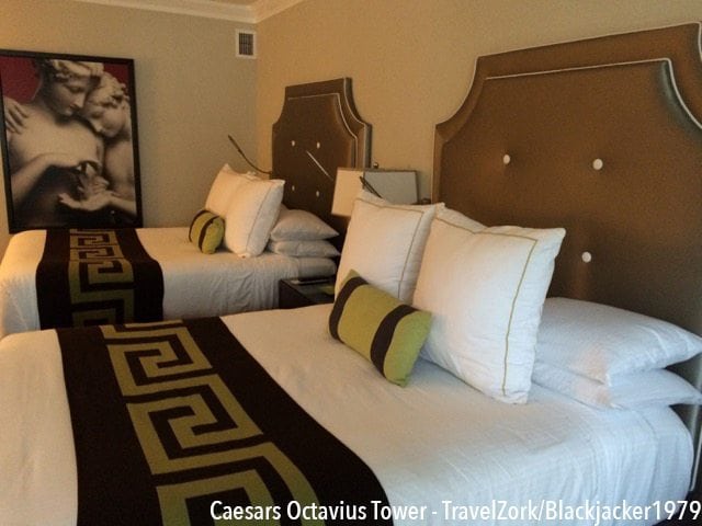
Recently my esteemed colleague got a great comp to Octavius as I did on my trip, but in his case he was given the “high roller within a limit” treatment of Octavius and on a fight weekend. Unlike my room however, baccarat_guy was given the two queens version of the same King Luxury I had. As he confirmed (when not using the also comped entertainment passes, total score) the room, for Caesars, is a departure from the norm to the boutique side for the better. A modern nod to classical antiquity, but in this case with not one but two beds.
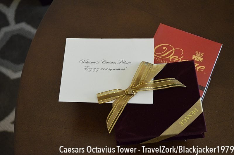
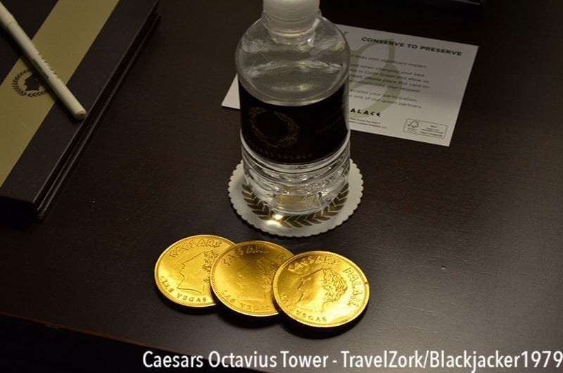
At the end of the day, I think my stay at Caesars can be summed up in one word. Altering. My attitudes on the entire place have been shifted by one stay, something that no one save Encore (in its early operating days) has been able to pull off. The shift is so strong, I’ve chosen to revisit Octavius over many of my previously preferred suite options around Vegas.
In conclusion, every bit of the stay and encounter with personnel was charming, from housekeeping, to the check in, to turn down, to Total Rewards, valets, bellhops, and even dealers. With a room product like Octavius, and an operational excellence above anything I expected, the layers of time can be neglected and the overall picture becomes clear. In Caesars Palace, everyone is a Caesar. And that’s a damn good thing in my opinion.
*Note: This post has been slightly modified and updated from its original version. (Originally published May 2015.)
Caesars Casino Loyalty Program — TravelZork
Caesars Total Rewards | Everything You Need To Know – Part 1
Everything You Need To Know – Part 2 | TIER STATUS
What is a Caesars Marketing Offer? – Part 3
Generating Casino Offers (Marketing Offers) – Part 4
Achieving Caesars Total Rewards Seven Stars Status With Video Poker
Other Vegas Hotel Reviews :
The Salon Suite at Encore Las Vegas
LUX King at the SLS Las Vegas
Las Vegas | Paris Las Vegas Classic Room Review
Embassy Suites at the LVCC (aka A Gamer In A Non-Gaming World)
MGM SKYLOFTS Las Vegas
MGM SKYLOFTS Las Vegas 2.0
The Cosmopolitan Lanai Suite
Deluxe King at The D
Deluxe Room at The Linq Hotel

Eric loves blackjack, architecture, hotels, more hotels, more blackjack, art and design. He grew up drawing hotels, and now spends his free time traveling to see and experience some of the greatest hospitality experiences in the gaming world while using his education in architecture as a tool to analyze how the best hotels in the world are created and developed.


