When MGM announced THEhotel, the all suite hotel tower at Mandalay Bay, would be taken over by Morgans hotel group and rebranded as the Delano, resurrecting plans for the former Echelon property that had been killed off with the great recession, many questions swirled about just how extensive the rebranding would be. Peeks were given of gold, lightness, and a mid-century but modern flair. And many of those questions were answered when I arrived at the hotel and began exploring, as detailed in Part I of my review. The common areas had a total makeover, and it was more than skin deep. But now I’m standing at the door, betting that they had really pulled off something special.
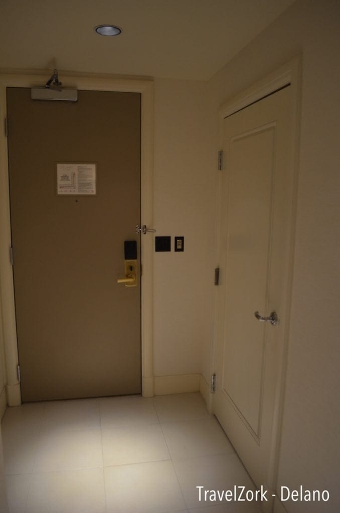
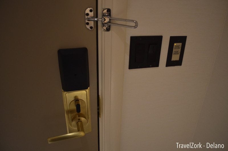
Just inside the room, it’s evident just how much change has been made to the former suite aesthetic. Although the design and layout are the same, there’s little else (outside of a few odds and ends) remaining. Gone is the dark cave-like feel of the former suites, replaced with light and airy space making the rooms feel larger than they are. Inside the door is a DND/Housekeeping call button, which works by changing the color of the illuminated ring on the doorbell outside the room, something that’s becoming standard fare with high end properties. Also present are switches for the lights, although there are no dimmers present.
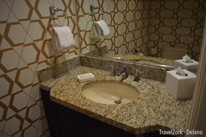
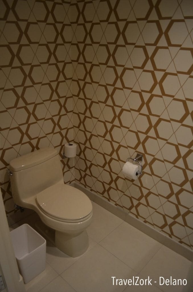
To the left is a door to a small powder room. Inside the cabinetry has been refreshed, but hard surfaces and fixtures are the same. The room is clad in a wall paper of interlocking golden hexagons, a recurring pattern that will present itself as we continue the review. Does it feel a little 1970s? Yes, it does. But at the same time it’s just calm enough to feel contemporary and not dated. And it’s definitely playful.
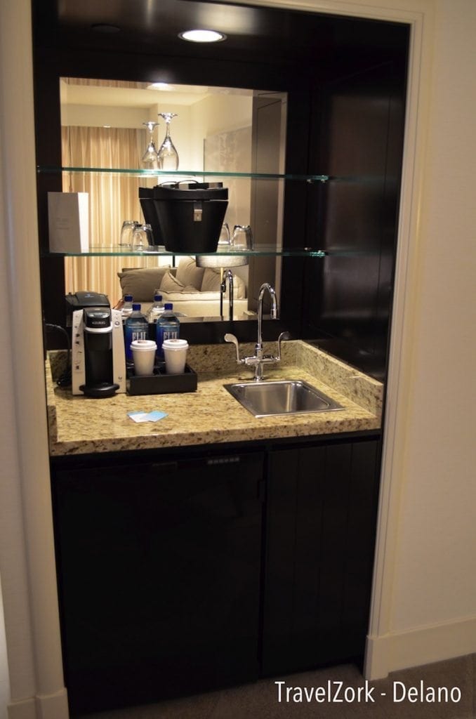
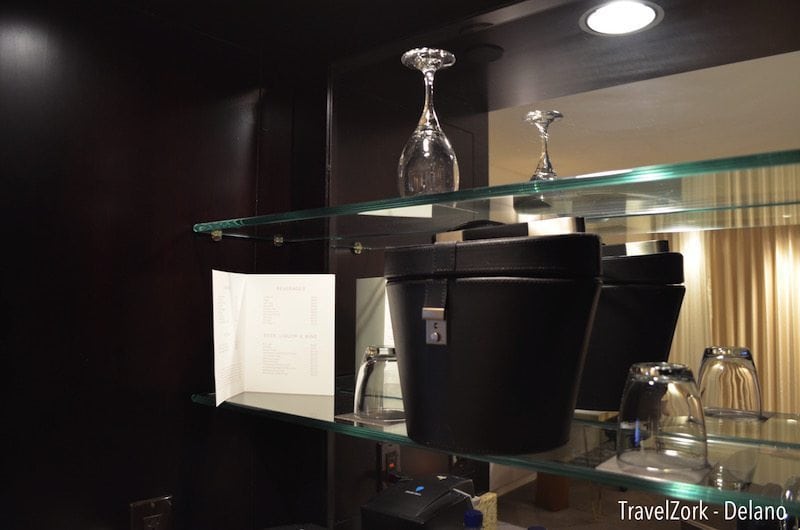
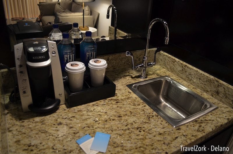
Just beyond the hallway is the main sitting room of the suite, consisting of a seating area, an entertainment wall with desk, and a wet bar area. The wet bar is on the back side of the room, with shelving with bar ware for entertaining use. There’s also a sink, and the now seemingly standard Keurig machine with coffee pods for sale should you choose to indulge as well as exceedingly expensive Fiji water.
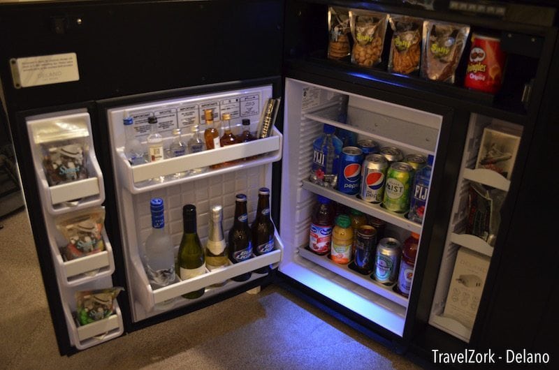
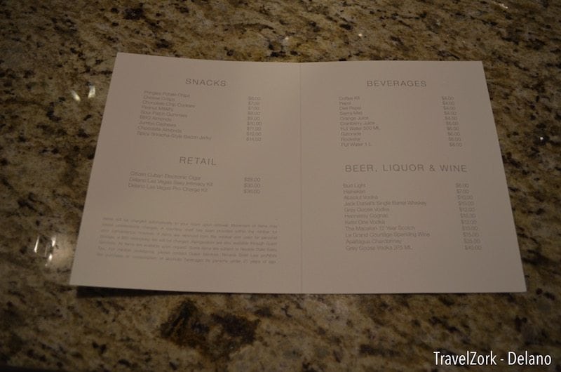
Below, the cabinet opens to reveal the minibar. There’s a standard selection of Pepsi products, as well a few kitschy items and some snacks on the same sensor system used universally. Prices are high, and it’s much easier to run down to the lobby if you really want to satisfy your appetite or thirst.
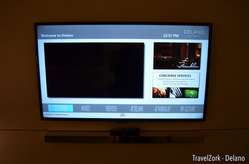
On the right wall of the room is long set of shallow white panels set onto the wall, in place of the previous large entertainment buildout. In the middle is a sleek wall mounted LED set, a simple gold shelf underneath to hold the remote. It’s clean, crisp, but not cold. The TV itself also features a new interface, responsive and easy to navigate, giving you information about the property and other features of available as in room entertainment.
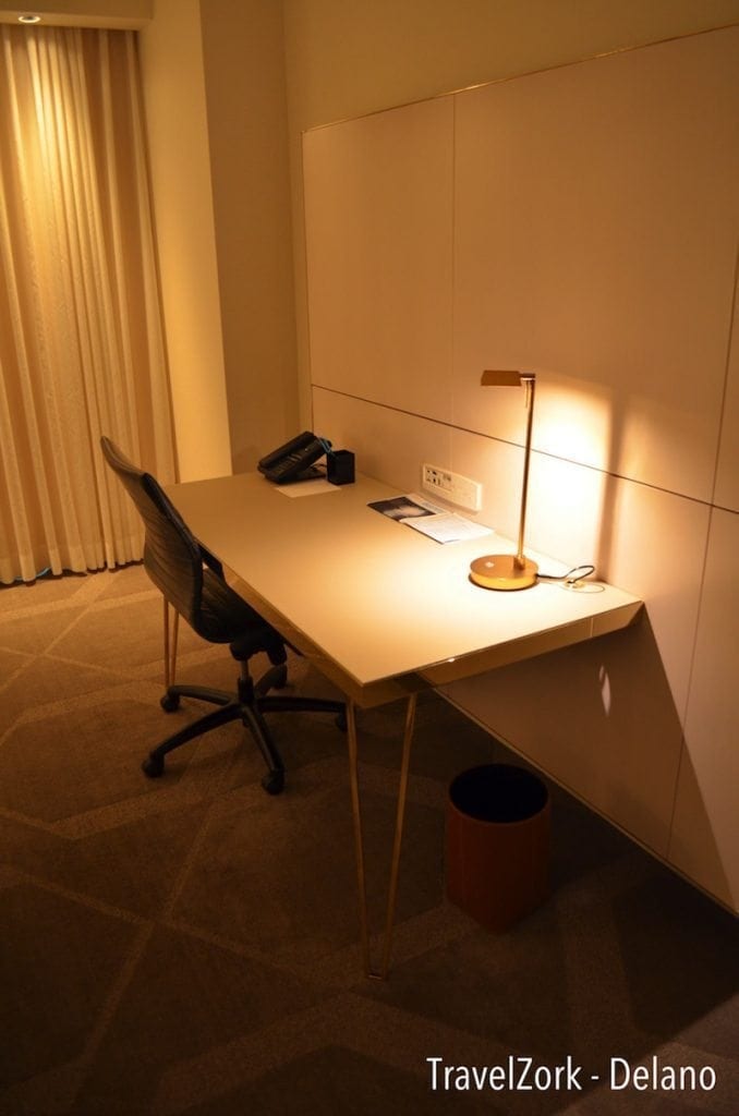
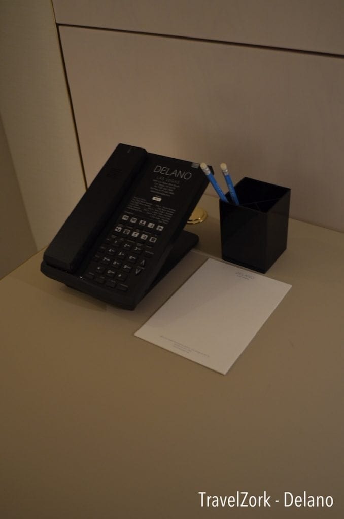
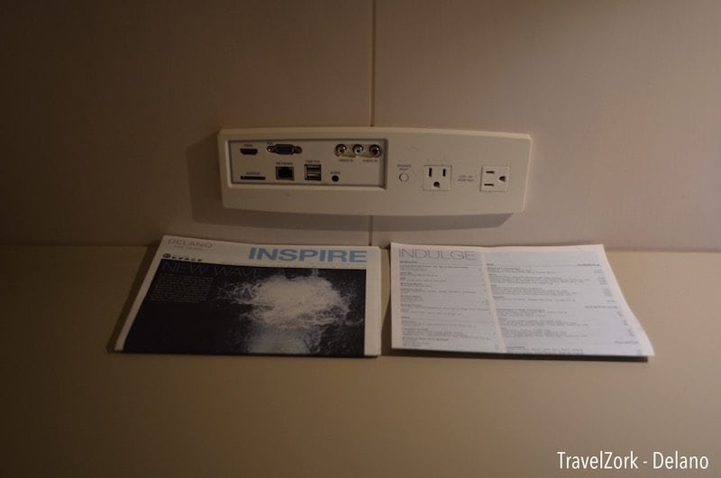
Just down from the TV is a desk, built in as an extension of the wall panels with gold V legs and the standard Eames knock-off desk chair in black. Atop the desk is a phone and stationery, as well as property information. There’s also an AV panel handy for plugging in devices for power, as well as connecting to the in room entertainment system if you’re one who likes to bring your own AV gear or adapters. The one oddity here is that the desk is clad in leather, a material which I can safely say will not wear well over time. It’s a miss, but a minor one as the design is still clean and sleek.
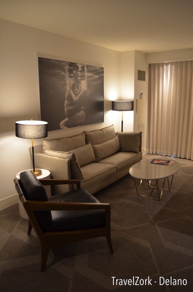
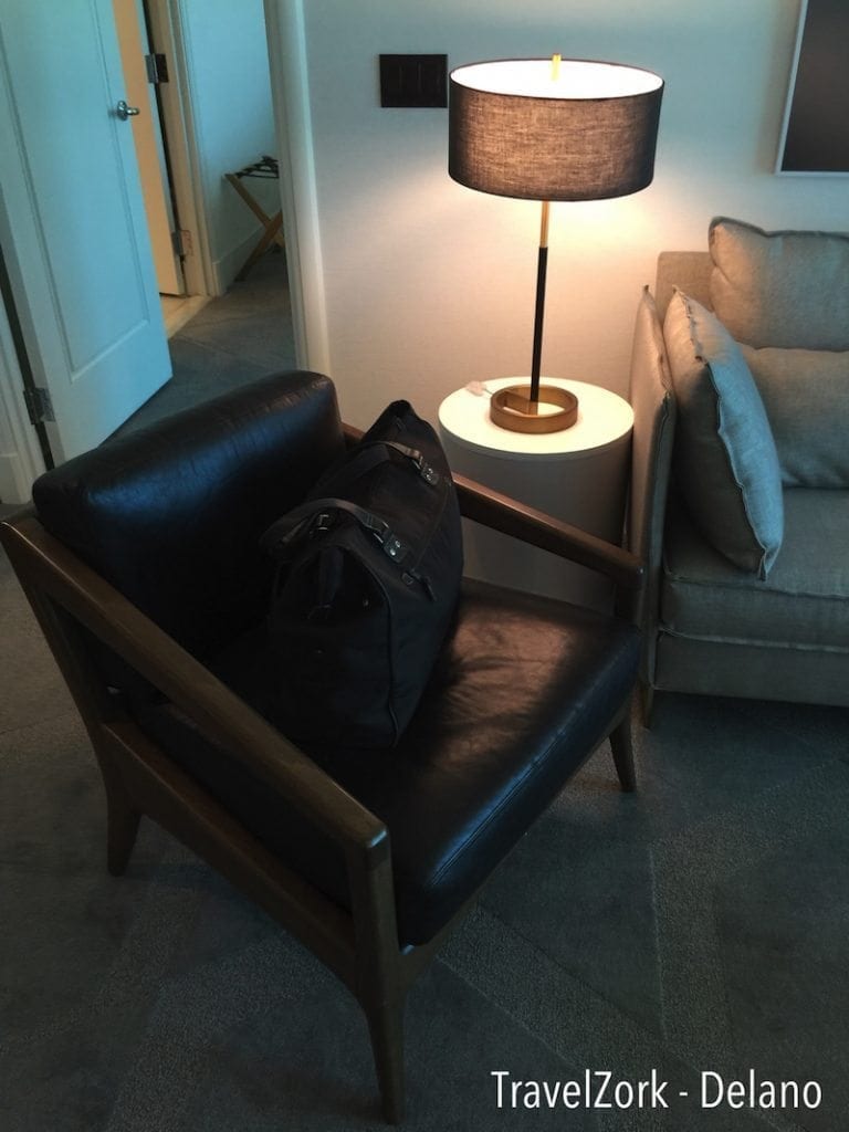
On the opposite side is the seating area, with more of the muted tones of the room continued up from the carpet into the couch with it’s extra cushions. There are two lamps, both with matching black drum shades, one a floor model on the far end and one a on a white drum table. They are simple and elegant, as is the art work on the wall providing a playful and restrained bit of motion to the calm. The coffee table echoes the desk, trading the leather for a white glass top and the same golden V-style legs.
In a nod to the inspiration, there is a standout piece of furniture in the room, one of those moments that, much like the boulders in the lobby, provides a moment within the design. It’s something as simple as a chair in this case, but one in wood and leather that looks like an heirloom mid-century modern piece. It ties the cold room together into a warm moment, all set off by muted carpet featuring the same hexagon pattern seen in the wallpaper earlier. At once it becomes evident that there is a balance to the design, and that the sea of white is there for just such moments to show themselves.
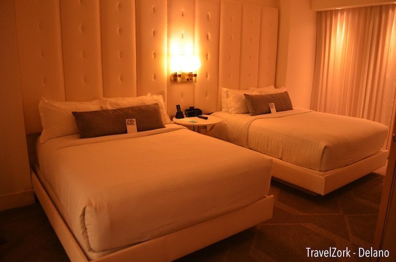
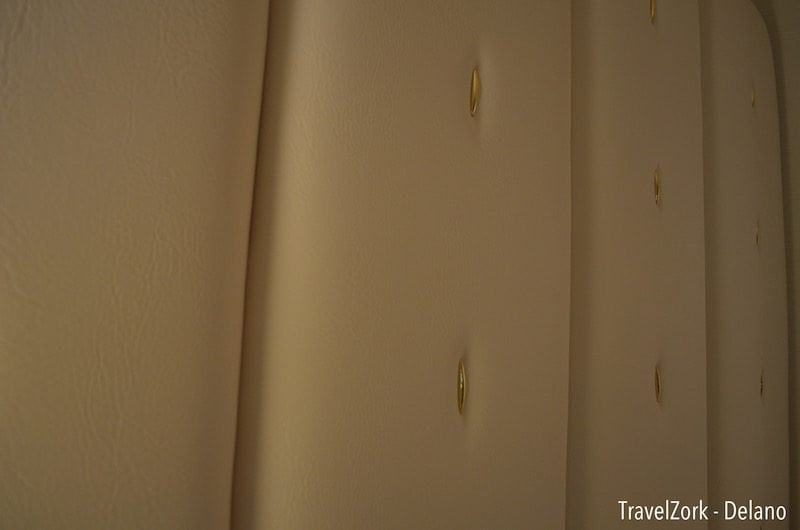
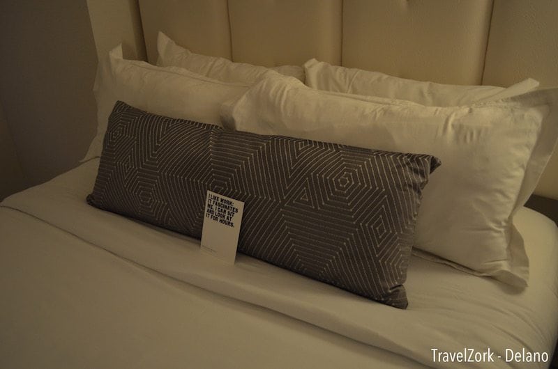
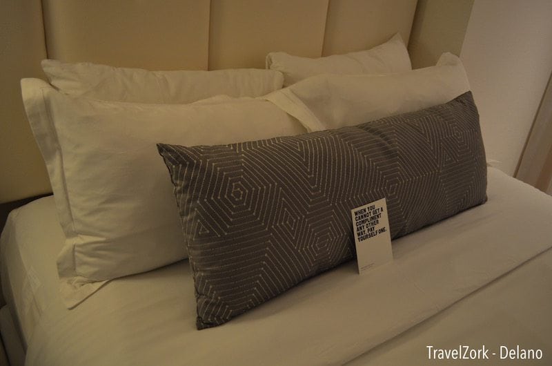
Having enjoyed the start, I was excited to see what was next. Moving into the bedroom, the theme of white and gold continues, this time with a wall of tufted leather with gold accents buttons creating a padded feel across the entire room in the effect of a giant headboard. The beds themselves, queen size, are simply dressed in white linens with the same leather on their platform bases. A single gray bolster pillow contrasts, with playful statements on cards harkening to the writing on the mirrors in the lobby. The beds themselves were unremarkable, comfortable but not a stand out. I slept soundly, but not so much that I would call it better than a standard hotel bed today.
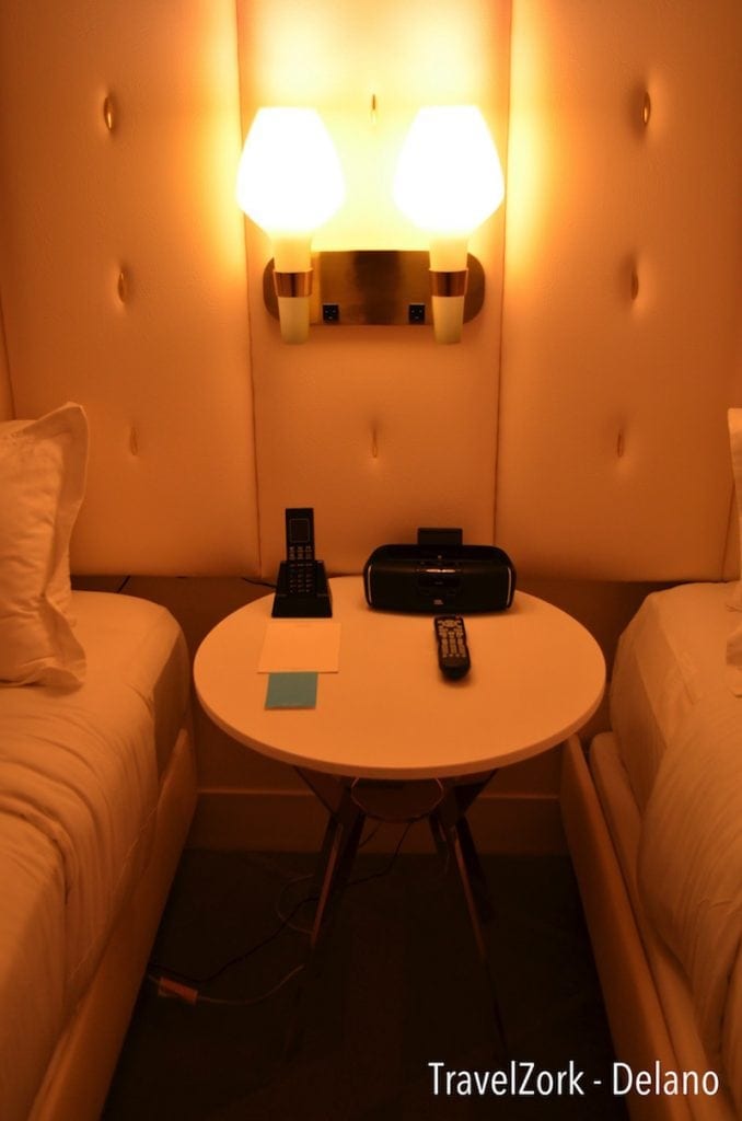
Between the beds is a table for a cordless phone, clock with dock for your iDevice and an actual Lightning connector, remote and pen and paper. Round in size, and with open legs showing dangling cords, the table sadly feels more like an afterthought than something designed. There are also no handy outlets, much missed in a time where they’ve become common place in room design. Above the table is a fun take on the traditional two light fixture found in every Motel 6 in the country, this time replaced with gold accents and blown glass shades. It’s a playful throwback, and creates warm, inviting light at night.
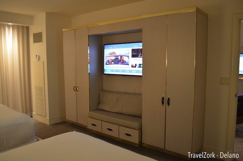
Opposite the bed is a large built in unit, replacing the lack of closet space in the room and adjacent to one of two HVAC units (separately controlled) in the suite. Much like everything else, it’s clad in white with gold accents, offset by gray cushions on an alcoved bench. In the alcove itself is another wall mounted TV, and underneath the bench below are drawers that are decorative more than useful. The TV functions in the same way as the living room, although I couldn’t get my device to connect through the AV panel in the other room.
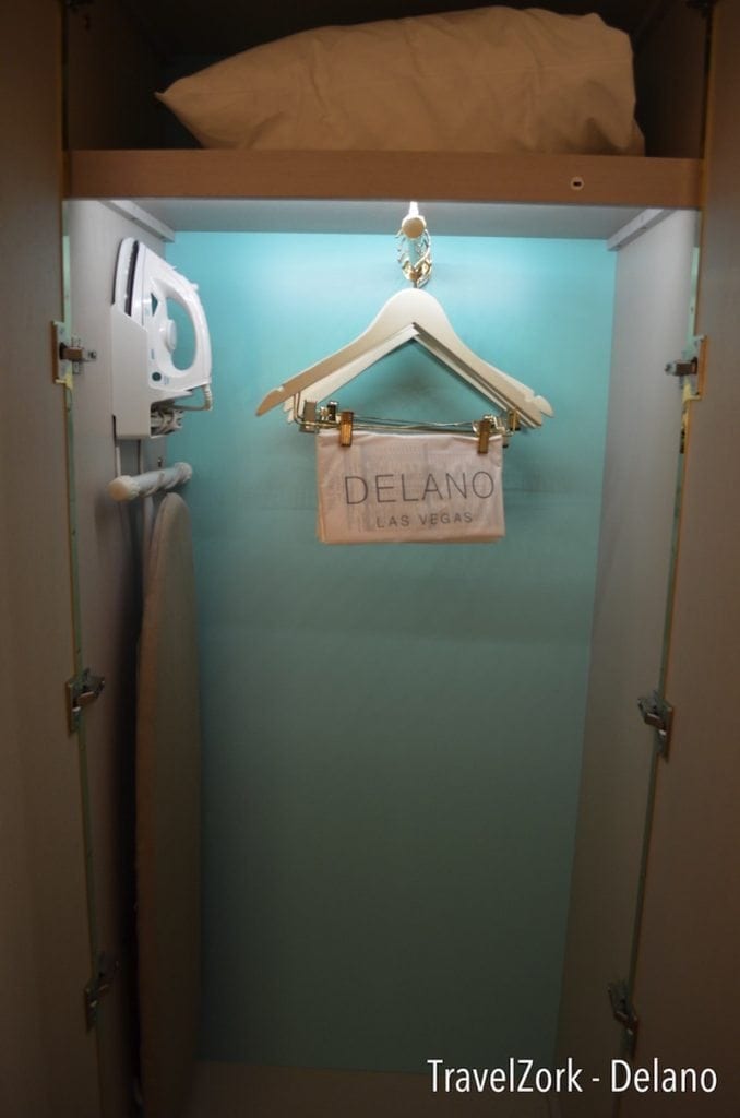
The left cabinet opened up to feature yet another surprise, a pop of sea blue setting off the warm tones of the rest of the room. Inside is a laundry bag, extra pillows, and the usual iron and board. Hanging is oddly arranged perpendicular to the doors, making seeing all hanging selections a bit difficult.
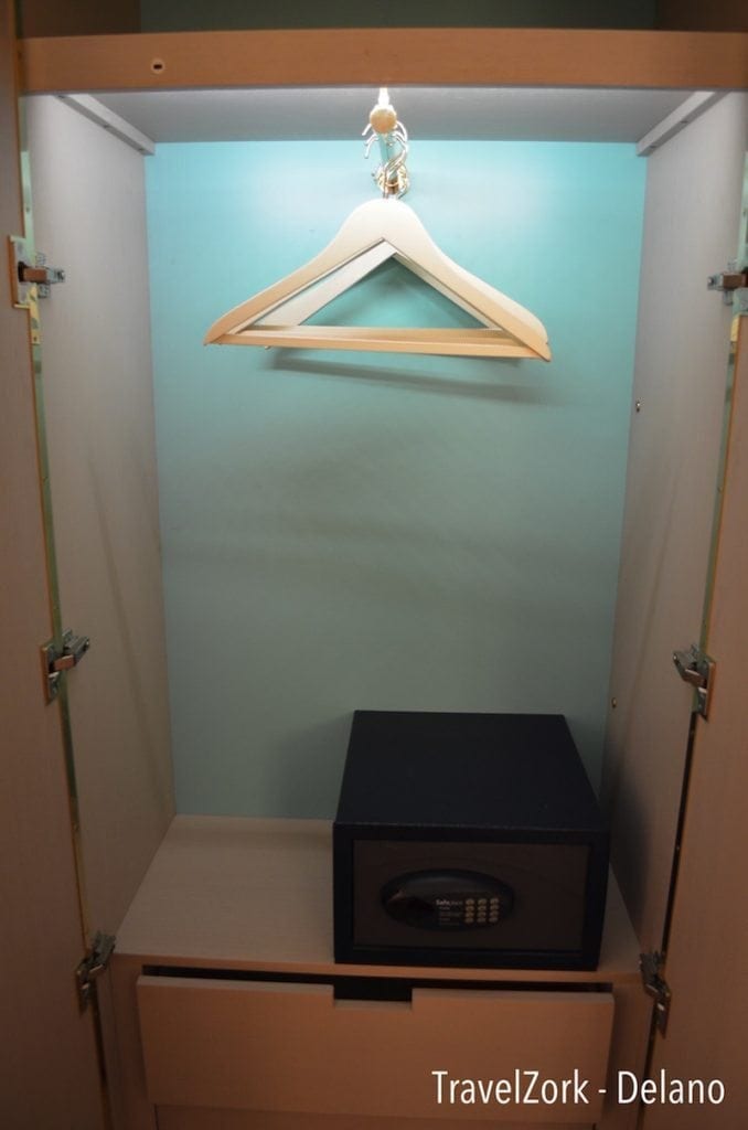
The right cabinet features more linear hanging space as well as a safe and more drawers, these being actually useful compared to the others under the bench. Again, the pop of blue reminds you that there is thought going on here to create subtle offsets of color against the muted overall scheme.
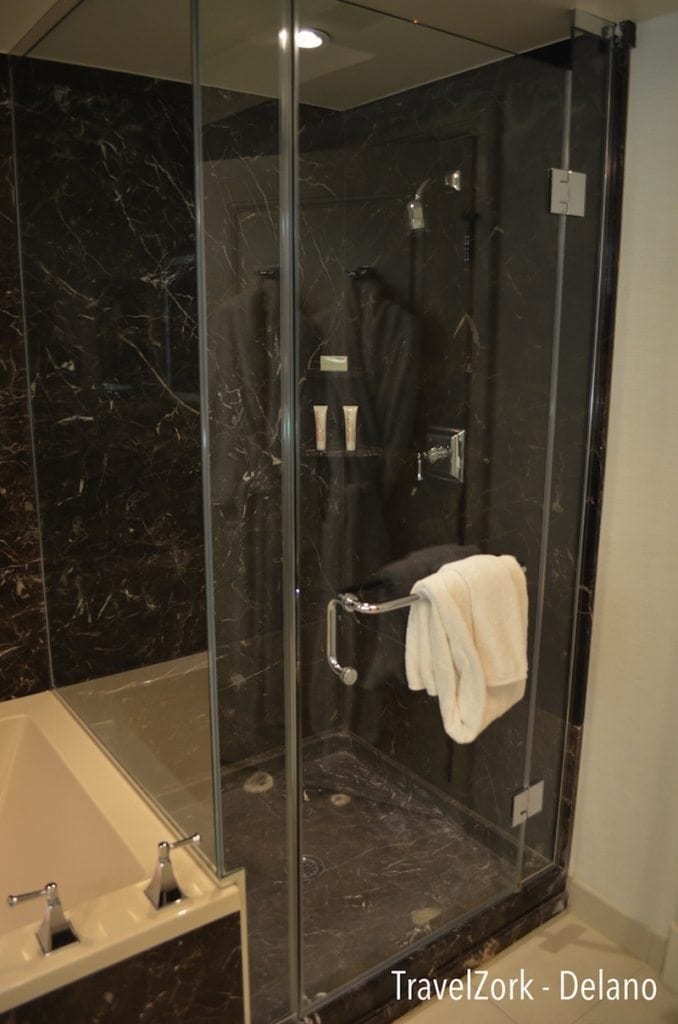
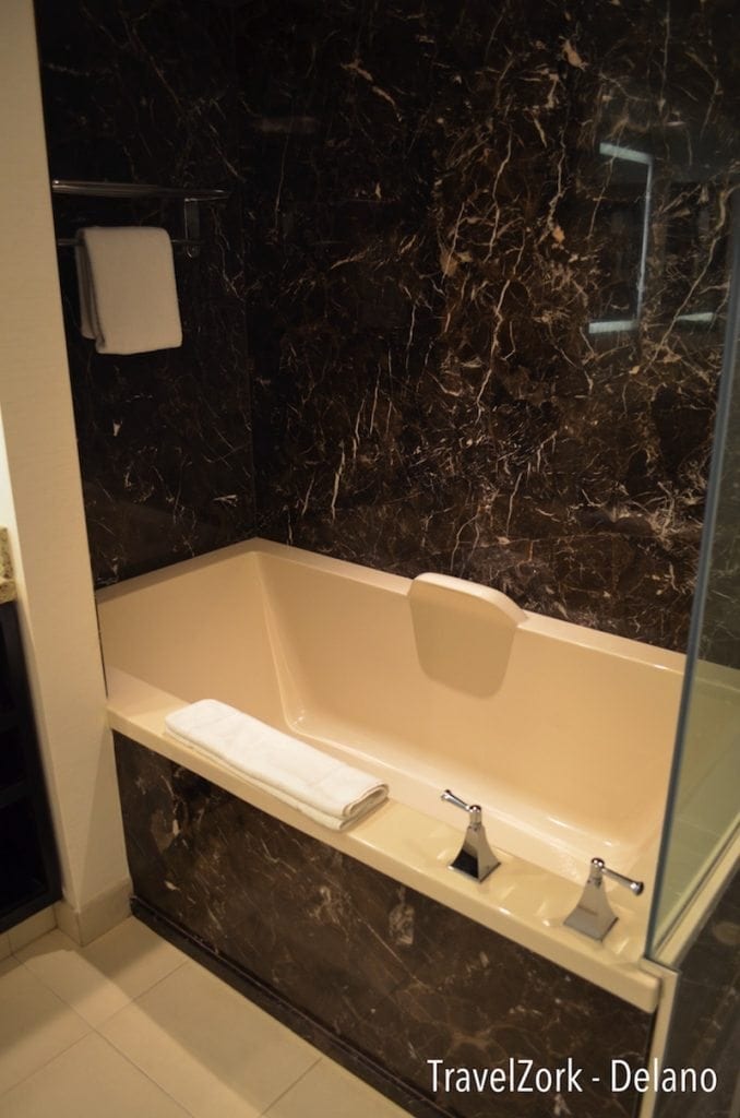
Rounding up the suite is the bathroom, something that has the most intact pieces of the former hotel’s design left in place. Why you ask? Because the original bathrooms were incredible, with walls clad in black marble slabs surrounding the large walk in shower and deep soaking tub. The hardware has been spiffed up, but sadly remains the same, and although the shower is forceful, a better shower head wouldn’t have hurt.
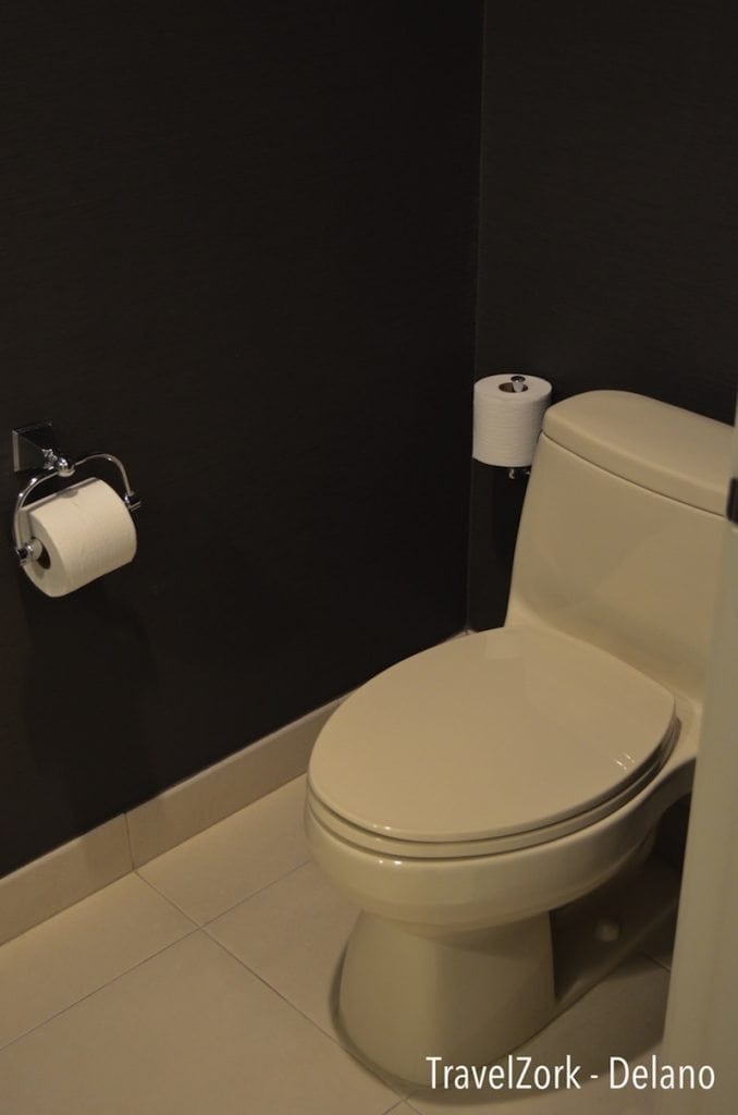
To the side is a self enclosed water closet, with dark wallpaper offsetting the light tile floor. No phone here, but an extra roll is in reach.
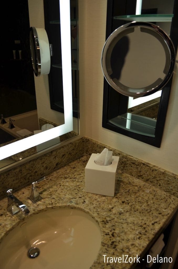
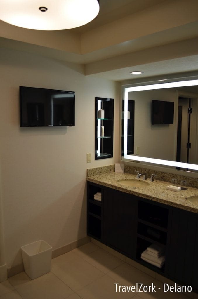
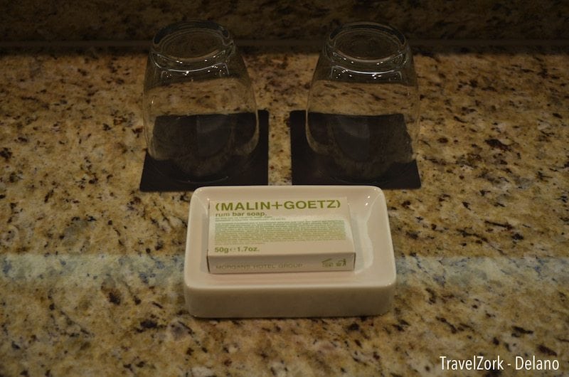
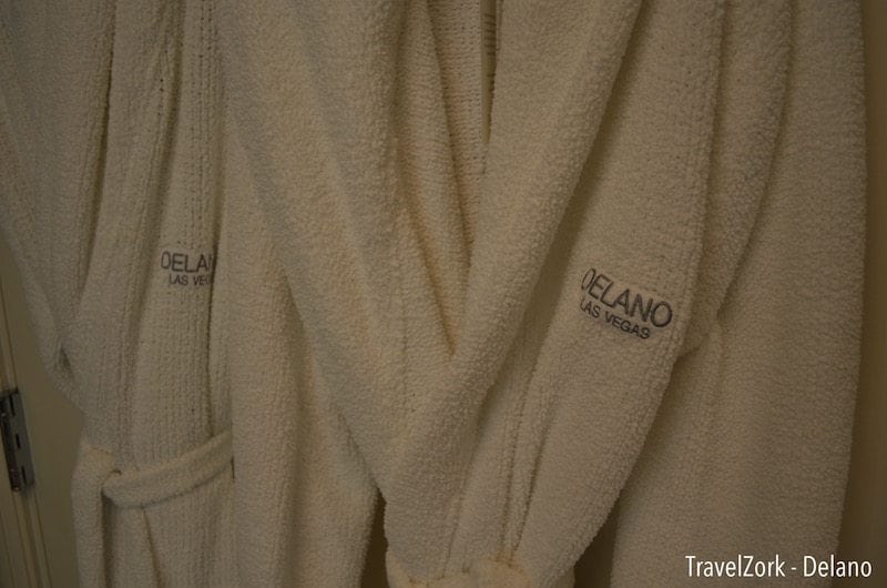
Much like the other walls, the main vanity keeps the same top, with refreshed cabinetry as before. The mirror has been replaced with a large halo-lit rectangular unit, and there’s a newer model wall mounted TV for viewing while bathing. The two sinks each have inset shelving, much like the Borgata, for keeping things handy and the counter uncluttered. The bath products are by Malin+Goetz, much like the Mondrian in Los Angeles and most other Morgans properties. And thoughtfully hung on the wall are two spa robes for lounging around after you clean up or before you go out.
In the end, what Morgans group has done to one of my favorite hotels is nothing short of a miracle, although one based on a solid base. The bones of a building can define its future, and in this case the Delano took the best of THEhotel and repurposed them into something transformative and new, classic and contemporary. And beyond the amazing rooms, the hotel is available for rates that are reasonable amongst any of the luxury hotels on property. For our stay, we took advantage of a promo that gave us a room for less than the running rate at Aria that night, but threw in a $75 Resort Credit that essentially took the cost of the room down to a little over the credit received. It’s an aggressive ploy to get people in the door, and I think once they do, they’ll understand that the Delano isn’t about taking Mandalay Bay up a notch, but rather creating an enclave within.
As I said earlier I made my bet, and in this case I think the Delano, like myself, will win the big payoff in the end.
The Fine Print:
Hotel: Delano at Mandalay Bay
Room: The Queen Suite
Rate: Varies, $199 on weekends typically, highly variable with frequent discounts/credits
Resort Fee: $27 plus tax (WiFi, Local Calls, Gym Access)
Parking: Valet and Self, Valet Not Complimentary
Room Service: Yes
Be sure to explore other great casino reviews on TravelZork.
The Salon Suite at Encore Las Vegas – Part I
The Salon Suite at Encore Las Vegas – Part II
LUX King at the SLS Las Vegas
The Octavius Tower at Caesars Palace
MGM SKYLOFTS Las Vegas
Eric loves blackjack, architecture, hotels, more hotels, more blackjack, art and design. He grew up drawing hotels, and now spends his free time traveling to see and experience some of the greatest hospitality experiences in the gaming world while using his education in architecture as a tool to analyze how the best hotels in the world are created and developed.


