As I wrote in my retrospective and analytical pieces on the DNA and evolution of design within the world of Steve Wynn and his properties, I was in the midst of an exhilarating journey through baccarat_guy‘s eyes. Just like with our readers, I was going along for the ride that was arguably the biggest casino resort opening of the decade. And as we saw through those glimpses, Wynn Palace, when unveiled in her full glory, absolutely did not disappoint.
What I wasn’t expecting, other than the glossy press images already released, was what the experience and stay would actually be like. A beautiful package is one thing, but would the feel fit the look? While I can’t say that I experienced it first hand, I will say that impressions as well as information given prove that in the case of Wynn Palace, the stay experience takes luxury to a level beyond anything Wynn has created to date.
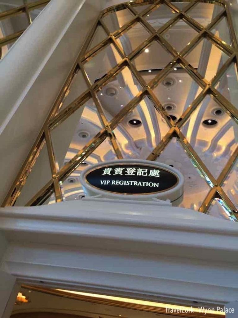
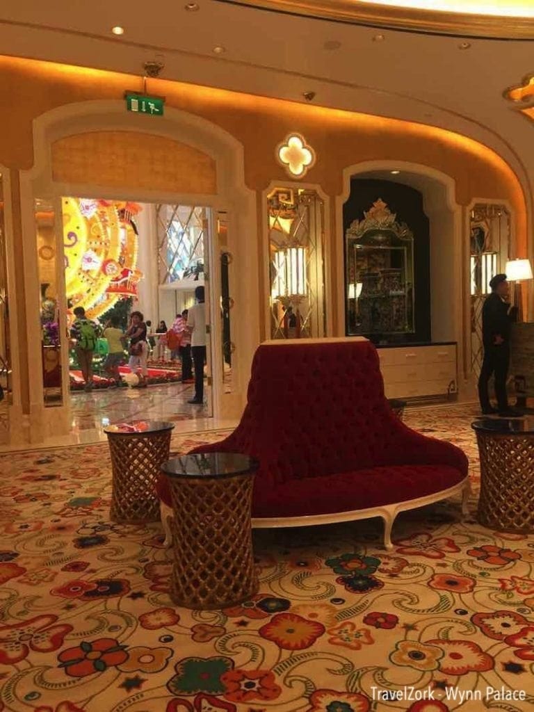
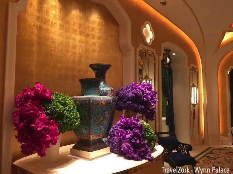
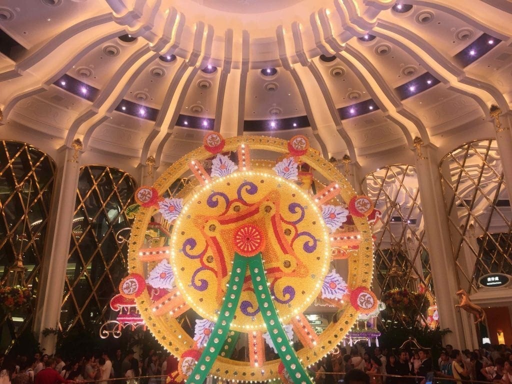
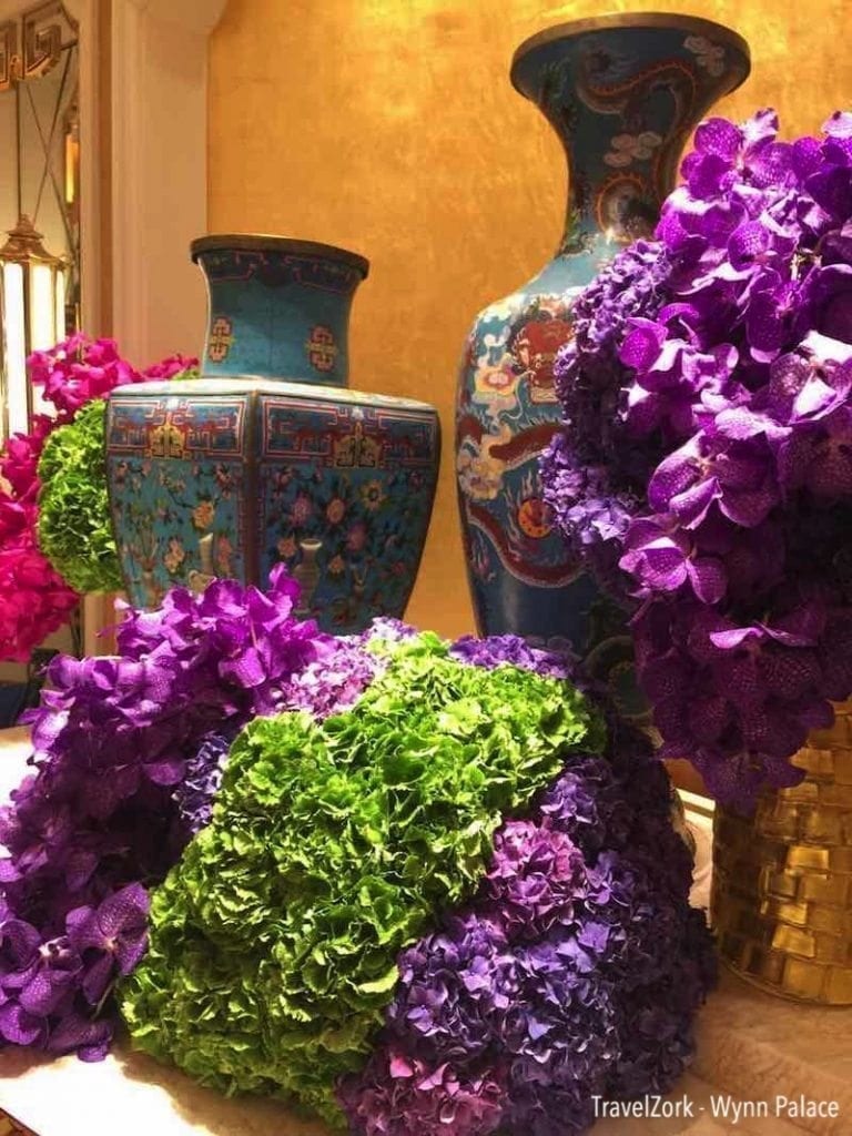
Wynn Palace, being shaped like an elongated X, is bifurcated into two reception lobbies with two separate Preston Bailey floral installations. Arrival in this case occurred in the south entry, adjacent to the floral wheel and the magnificent space created to display it. Beyond the main reception, just off the rotunda, is a smaller, more intimate VIP registration desk, and this is where check in took case for the stay. Much like the Encore Tower Suites, the room is cloaked in rich shades of gold and green, but accented by beautiful floral arrangements in line with the hotel’s theme, and gold mirrors and art pieces that accentuate the color and tone of the space.
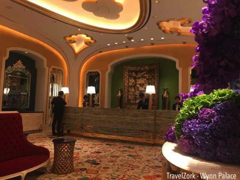
The check in desk itself is much again like Encore’s Tower Suites desk in size. There are several stations at a large green stone desk adorned with another of the hotel’s recurring design motifs along the base, as well as an inset display featuring a Chinese triptych and more of the same accent vases in gleaming gold. Passageways at both sides are framed in right navy and green curtains, tassel tied to one side. And this pattern is repeated around the room, with the niches filled with furniture, mirrors, or other displays that evoke the floral theme of Wynn Palace.
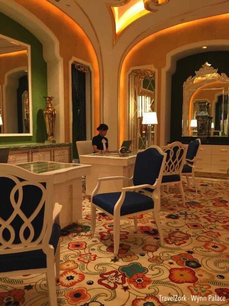
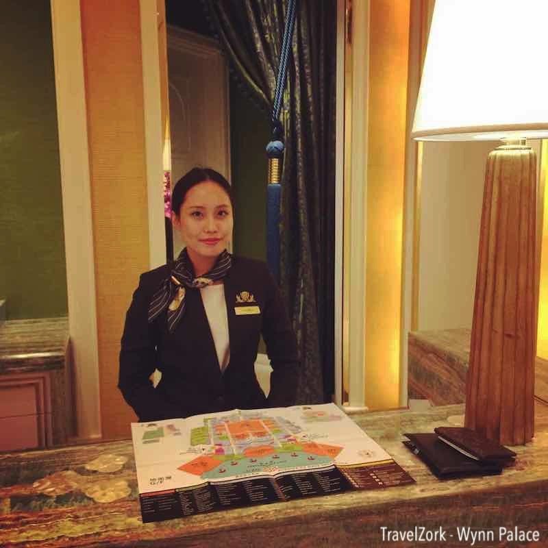

Also of note in the room are several concierge desks, each private and allowing the guest the one on one service that Wynn has become known for over the years. And the service extends to the check in experience, which is made simple and polite, with amenities offered for a traveler that might want a bottle of cold water, and all check in details made straight forward through use of an iPad to confirm stay information.
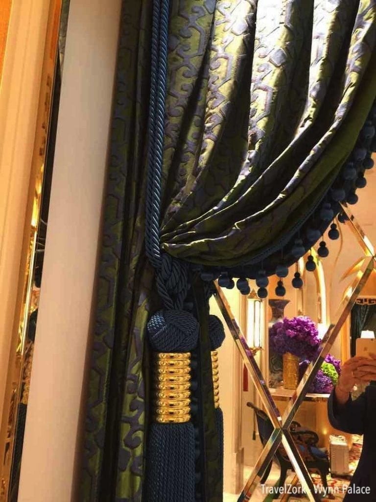
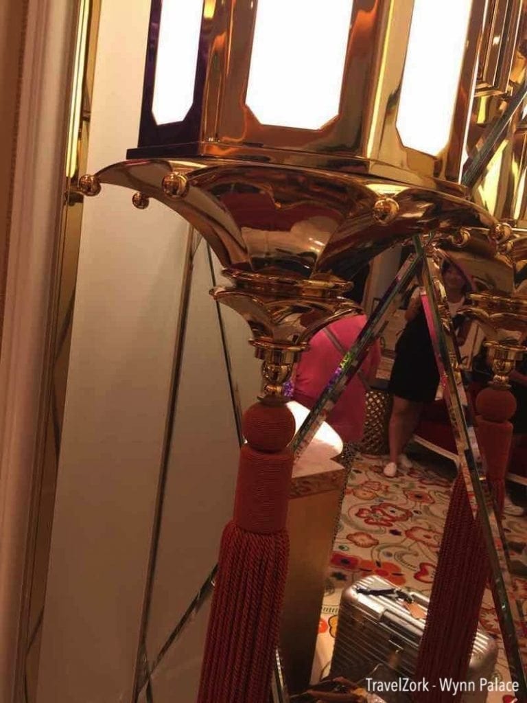
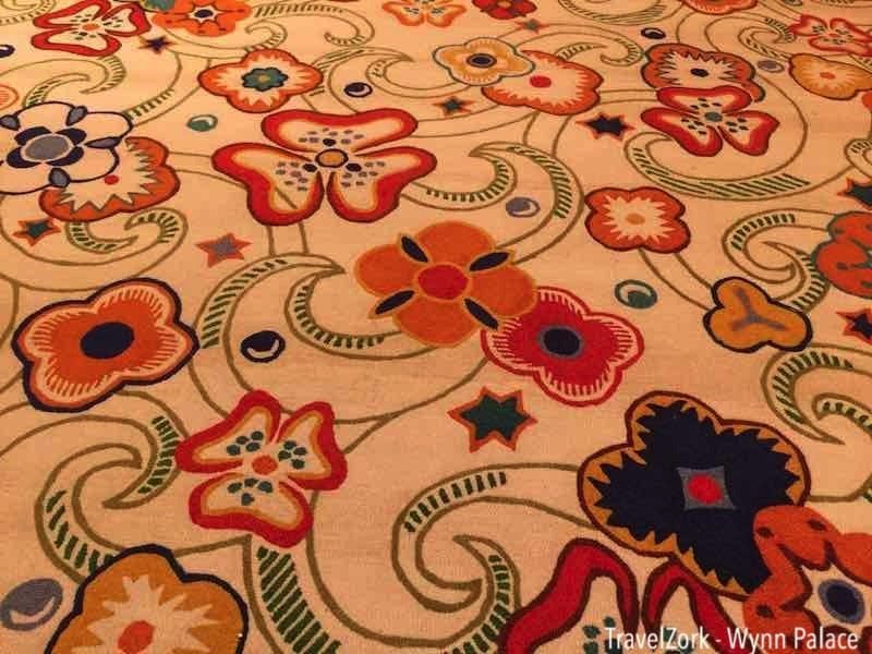
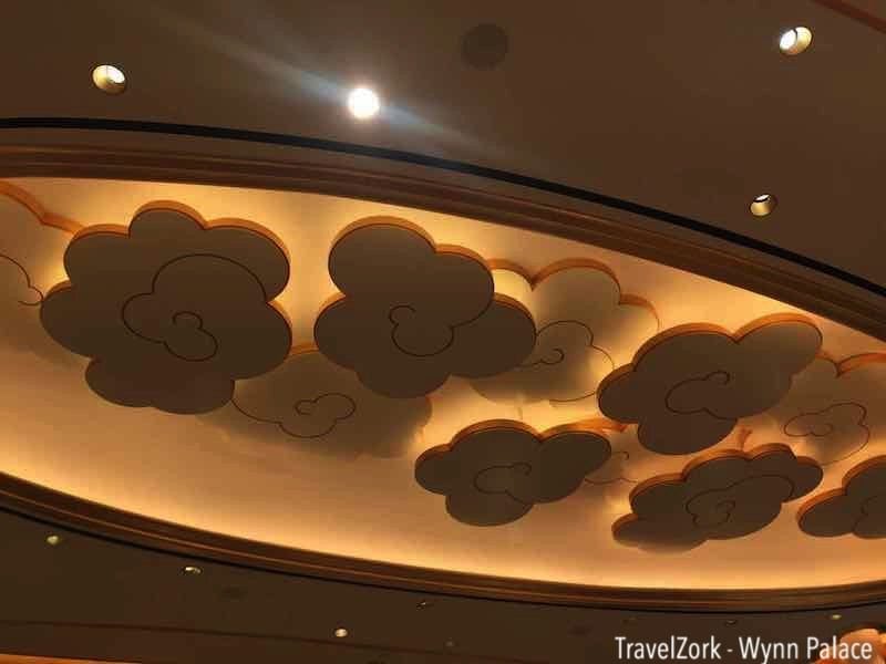
But before leaving for the room, one has to look more closely at the details and design that went into creating a space. As with Wynn and then Encore before, the design team has taken what might be in other spaces considered to be over the top and found a balance that creates a harmoniously beautiful space The room is adorned with offset lighting in both whimsical shapes as well as the resorts signature quatrefoil pattern. The ceiling disappears into floating whimsical backlit clouds. Tassels adorn every curtain and gleaming lantern, and the flowers in reality and in the gorgeously appointed carpet bring every bit of the design back into harmony with the public space that lies just beyond the private lobby.
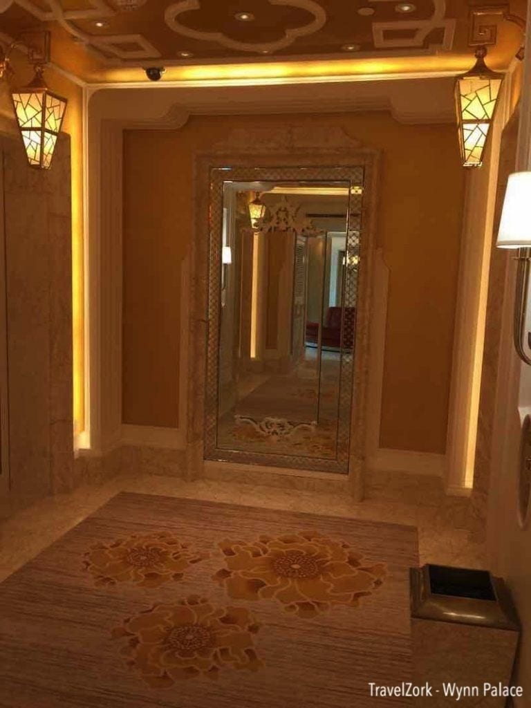
As mentioned, division of the tower into two registration areas creates two elevator lobbies, one to serve each side of the tower. In this case, as in the North, the South elevators are just off the reception area for easy navigation without dragging luggage through a crowded casino. It’s a quick trip to the 23rd floor where the suite is located, and one emerges into a serene color palette reminiscent of The Spa at Encore. Elevators are built with the same marble surrounds used in Encore, with the same details seen downstairs and the quatrefoil in gold adoring the doors. The ceilings and walls are gold, bathed in offset light and featuring white accent woodwork. The back wall features a mirror with a surround of diamond grid, another Wynn design throwback, and a pair of wall sconces provide the only other light above the banded and earth toned floral carpet.
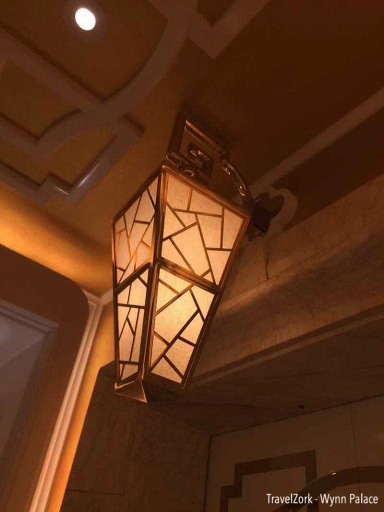
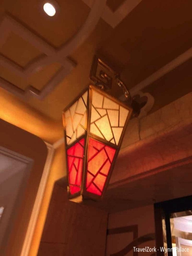
But not to leave this gorgeous space alone, the design goes one step further. Over each elevator hangs a single tapered trapezoidal lantern in gold lit with a warm glow, hanging on a golden arm emerging from another quatrefoil. To most this would simply look like another accent, but here’s where Wynn takes something beautiful and makes it magical. The lanterns are not only accent lighting, but directional indicators for the elevators, with the top or bottom section changing light color based on direction of travel. It’s just another special thing that takes the design above and beyond in the right way.
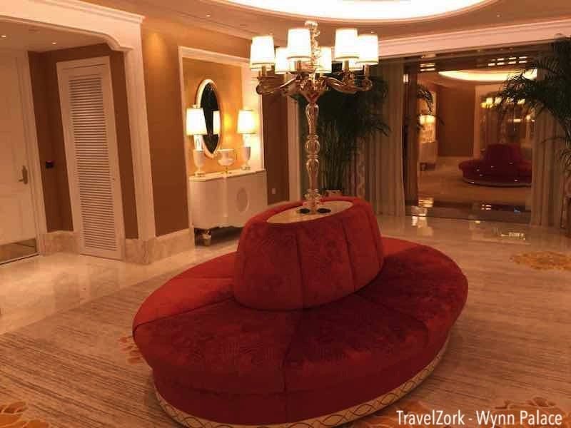
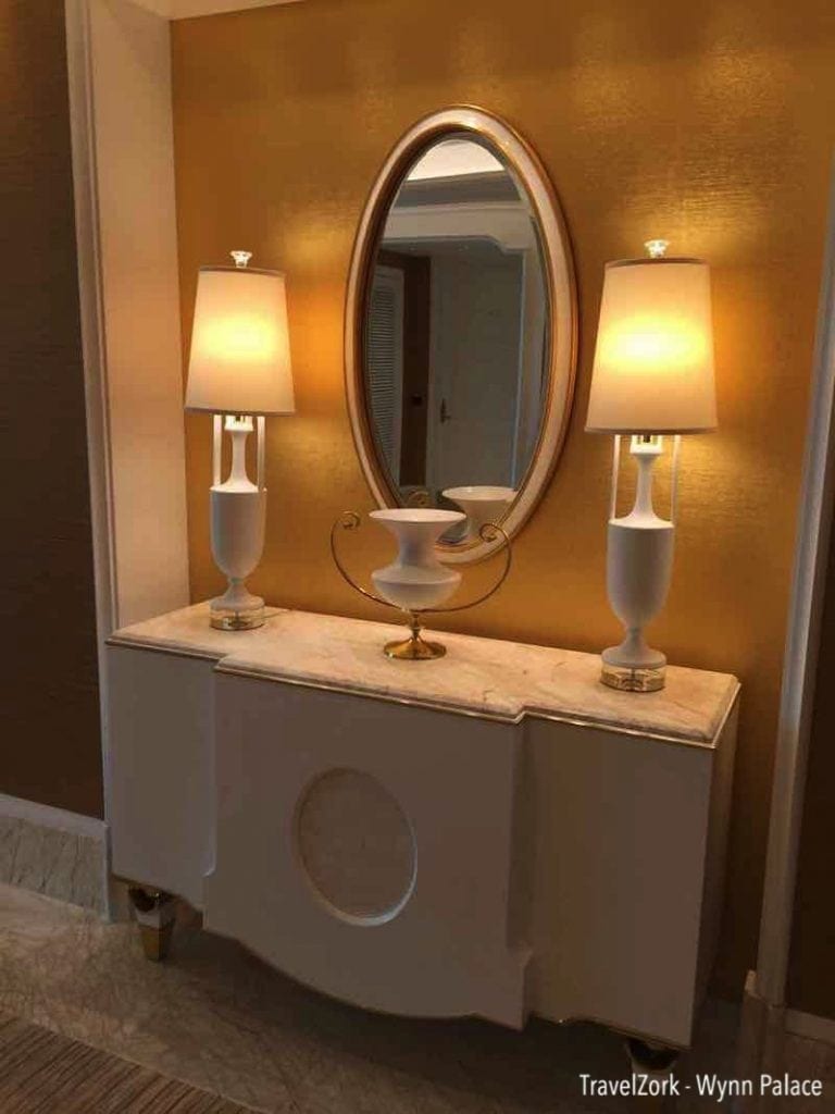
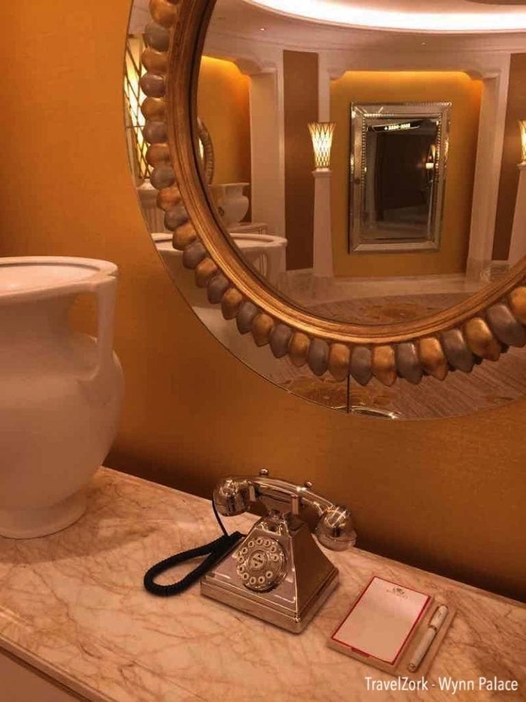
Exiting the elevator area, you immediately enter the South Lift Lobby, a more spacious place to wait while others may be on their way to join you. The room is adorned with inset areas featuring pristine white furnishings and lights, as well as mirrors and even one containing the signature antique style Wynn house phone and pad and pen as you’d find in any of his resorts. In the middle is a large red oval banquette with a lighting fixture emerging from its marble top. One side leads to the lifts proper, the other to a back of house area. There’s also a floor to ceiling window on one side to allow views of the Cotai Strip by day or night. The theme here is ovals, and as such, mirrored in the ceiling is an oval inset with more gorgeous indirect lighting showing off the polished marble and floral carpet floors just like in the elevator vestibule.
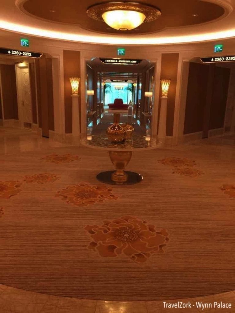
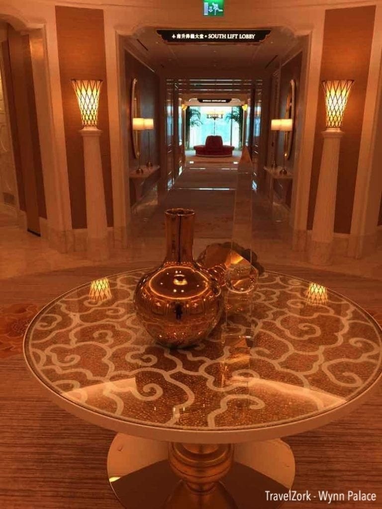
Just beyond the lift lobby is another mini lobby which splits the building directionally leading to the various parts of the Southern part of the hotel tower, in this case the two extending wings, and the main corridor. As with the lift lobby, the room is accented with signage leading you to your room, as well as standing lanterns between each opening whether it be to a hall or a niche filled with more perfectly matching accent decor. In the middle of the carpeted room is a golden table with golden vases atop, and above is a ring of indirect light, with another quatrefoil in the middle before a ceiling hugging light. A bit simple for Wynn? Perhaps as it might look like something you’d find at one of his first properties. But the propensity for over the top elsewhere offsets this slight difference.
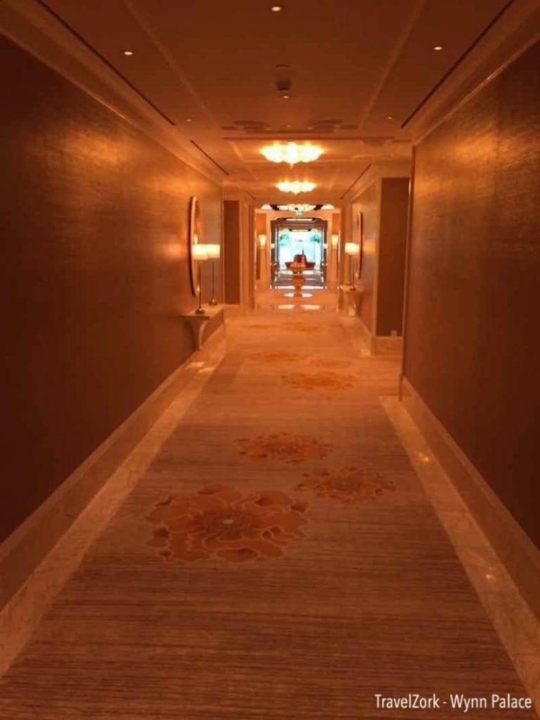
The corridors then become extensions of these public rotundas, following the same carpet and marble floor trim punctuated by colorful yet coordinated floral art prints, mirrors, shelving with simplistic but design conscious lighting and ceilings decorated with the same signature motifs we have already seen in the VIP lobby. Within seconds you arrive at your room, a beautiful pristine white wood door ready for you to enter and settle in.
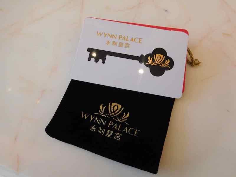
And this is where the trip has led so far. To a key card and a door lock. We’ll explore what lies beyond the door in the suite in part two of our review of the Executive Suite, and believe me, it’s worth the wait.
Also read:
Chasing Macau | Part 1 | Someone Is Opening A New Joint – Wynn Palace Cotai
Chasing Macau | Part 2 | Opening Night – And What A Joint It Is – Wynn Palace Cotai
Chasing Macau | Part 3 | Initial Impression Executive Suite – Wynn Palace Cotai
Retrospective: Wynn Palace and Design DNA
Eric loves blackjack, architecture, hotels, more hotels, more blackjack, art and design. He grew up drawing hotels, and now spends his free time traveling to see and experience some of the greatest hospitality experiences in the gaming world while using his education in architecture as a tool to analyze how the best hotels in the world are created and developed.


