Las Vegas has always been a town of casino moguls, or nowadays corporations, doing whatever it takes to one up one another and draw in revenue. From the mundane, like changing paint colors, to the wildly imaginative like total reinventions of entire properties a la the SLS, Vegas is always looking to set trends in hospitality to keep the most important people, the gamers, happy.
As part of that push, one of the major shifts in the last few years has been the model of the suite, or more often suite-style, hotel. Often for the price of a standard room, this new model gave you the feeling of luxury in the form of a true suite of rooms instead of a bedroom and bathroom. And one of the first to push the luxury trend was THEhotel at Mandalay Bay, a hotel that remained one of my favorites despite a downtrend in booking and lack of upgrades. It was fortune then that brought in the Morgans group, fresh off losing a deal for a portion of the dead Echelon project, into the mix as MGM’s (Mlife) choice to rebrand and refresh a gem of a hotel in need of a touch up.
Much like The Water Club at Borgata, featured in a previous review, the Delano is a separate hotel within the Mandalay Bay complex, with it’s own tower, entry, and amenities. Entry is to the rear of the property at a drive through area of the parking garage, formerly clad in gold and dark wood with low warm lighting. The entire theme of THEhotel was darkness and warmth, with dark tones, black granite, backlit stone, and pops of color. So imagine my surprise when we pull up to the port cochere and I encounter quite the opposite.
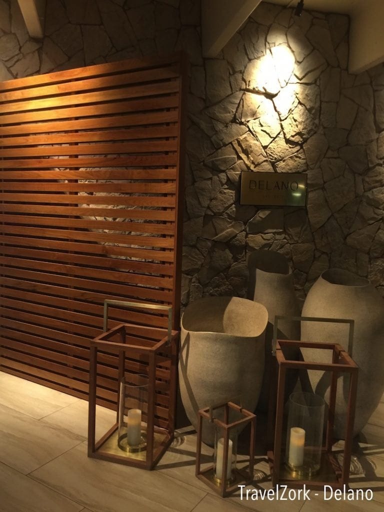
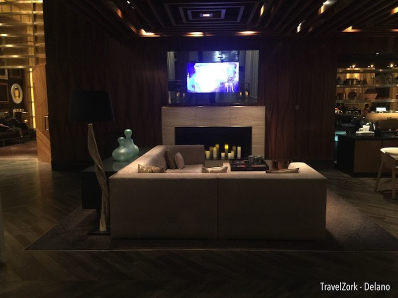
Gone is the darkness, replaced with warm wood tones, lanterns, washed stone walls and vases. From the moment you arrive, the Delano makes a statement of calm warm luxury, almost spa-like in nature. It’s also apparent from that moment that the makeover is much deeper than just a nip and tuck. Morgans has worked hard to turn the incredible bones of a great hotel into something special, something grand.
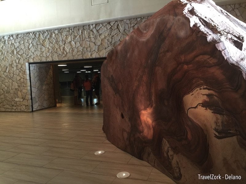
Just through the main doors is an interstitial space, formerly with a large table and glass sculpture. In it’s place are large natural boulders reflective of the desert landscape of the red rock areas nearby. Clean lines are broken by organic forms, creating a break bathed in warm light from natural skylights.
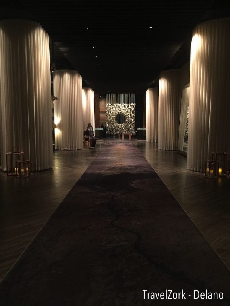
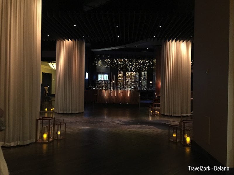
And just past that, as you enter the hotel, you are brought into a dark intimate space, cavernous in reality, but with materiality that makes the formerly long and tall space have a much more human scale. The hallways is lined with large columns clad in sheer drapery downlit to create a corridor of sorts, broken up with smaller seating areas and a bar.
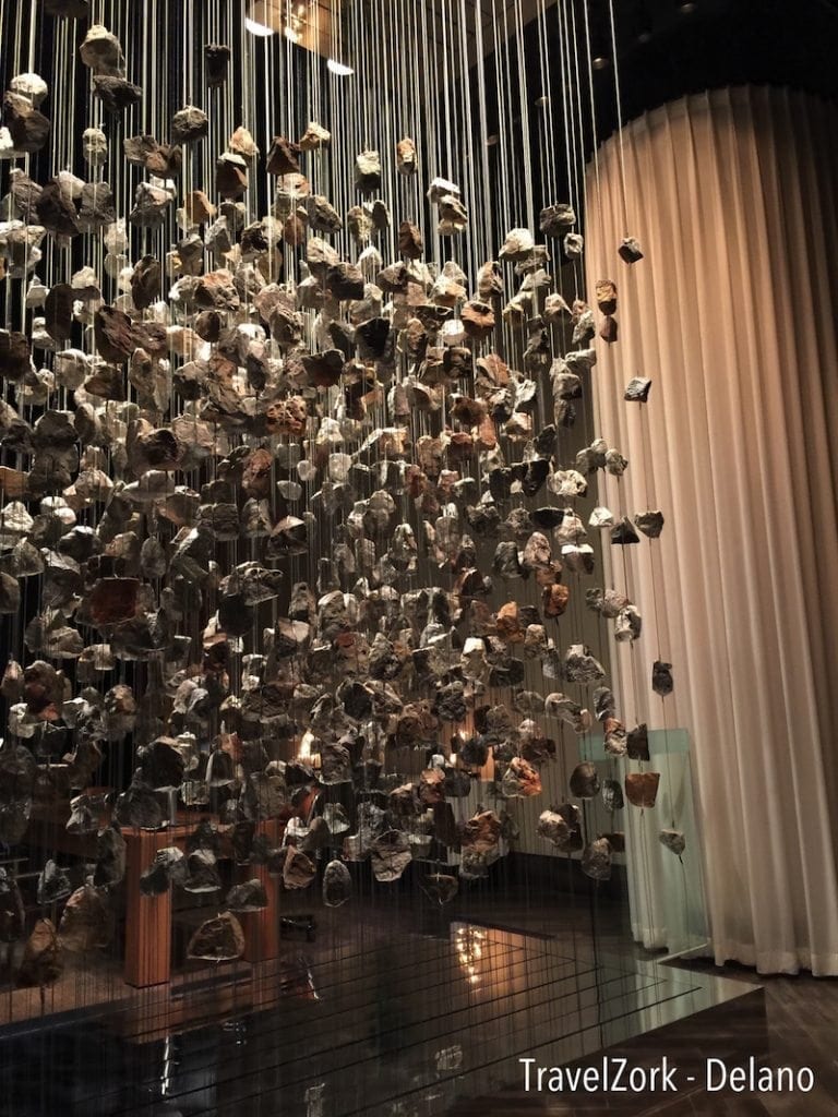
At the end of the straight path, one encounters an amazing art piece made up of rocks suspended in a pattern, a square with a hole in the middle. It’s a wonderful end point that allows views past, and breaks up the straight line of the typical lobby, allowing you to see just beyond it the front desk.
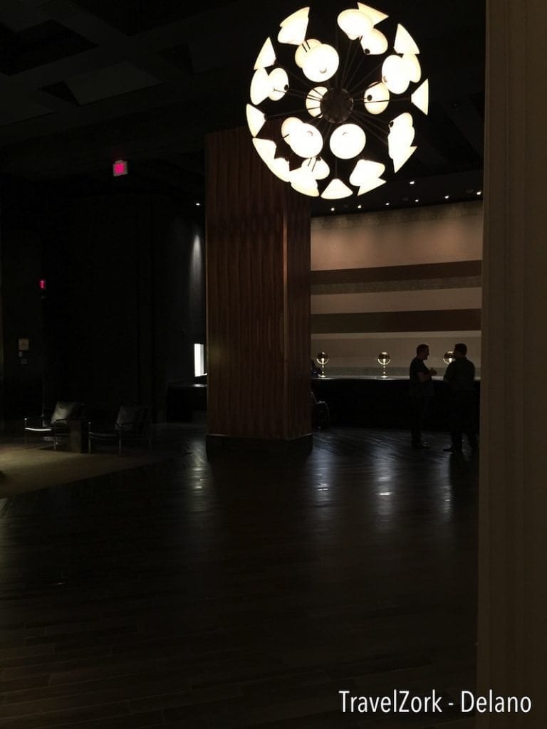
Wandering past more columns clad in fabric and lanterns softly glowing, the front desk, formerly a massively high space, remains intact, however the walls washed with striated earth tones, and soft lighting create that feel that transforms space with little effort. Check in was quick, efficient, and the staff friendly and courteous. We were handed our keys, told about the amenities in the room, and shown towards the elevators just behind and to the left of the front desk.
Also to note in the lobby are two more updates. The former bar has been upgraded with a raised seating area and a much more open feel, a nice gathering spot while waiting to check in or for your party to come downstairs, and the Cafe, which under former management was never open nor busy. It’s been replaced with a much simpler and scaled down restaurant open for quick bites on a vague schedule. Hopefully it’s improved, but I was unable to find out for myself. Also of note is that Mix, the lounge and restaurant by Alain Ducasse on the top floor is still open, but is in the midst of rebranding and reinvention, which as of my visit had not yet been completed.
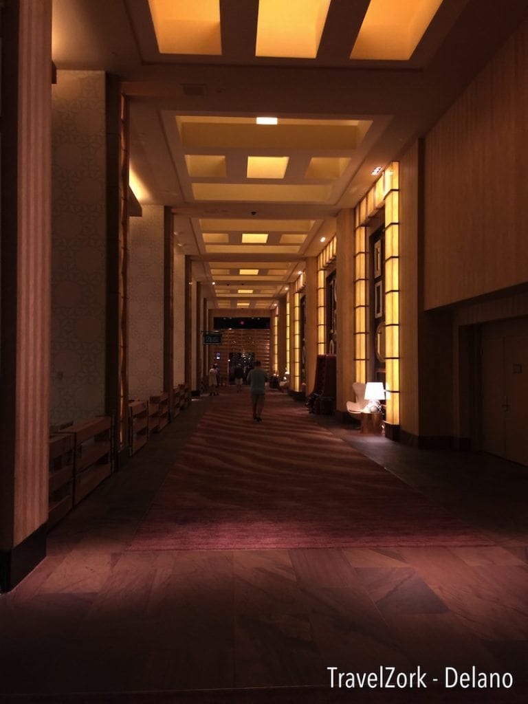 One of the most amazing things you’ll notice when wondering through the Delano’s lobby, it must be mentioned, is that the space is quiet. In fact you’d not think that you were less than a 2 minute walk from the bustling casino floor of Mandalay bay, when in fact you are. It’s a real retreat, with it’s own spa, where a patron can escape the bustle of the megaresort around him without being removed by leaps and bounds.
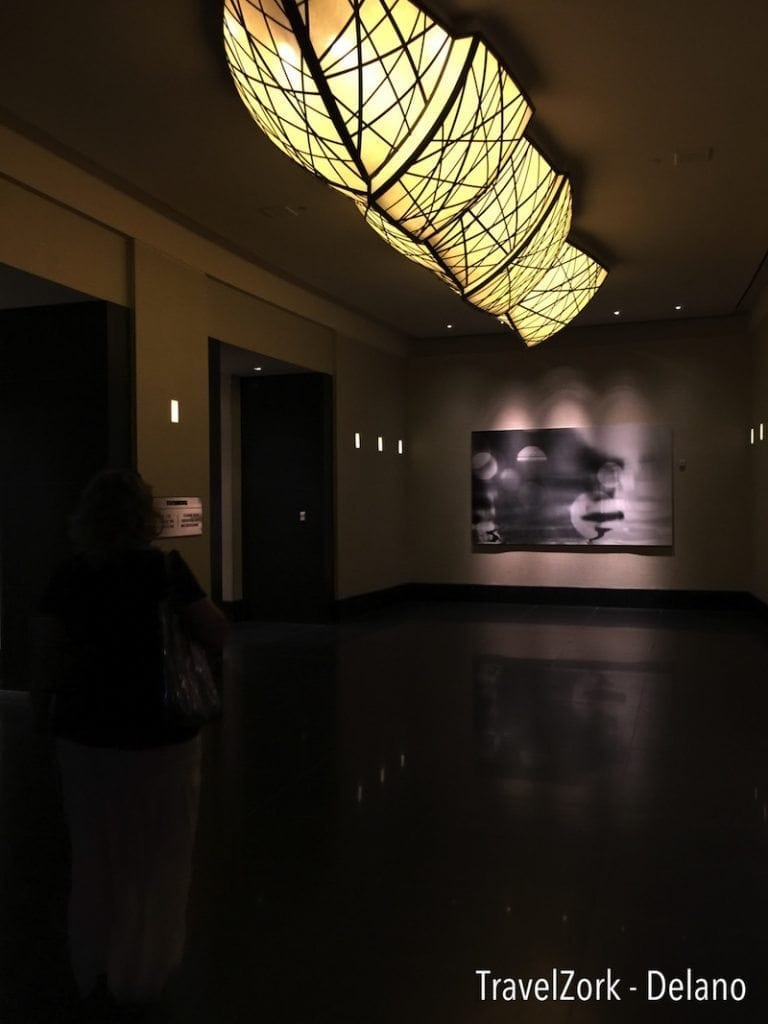
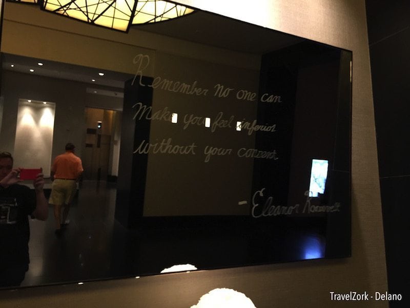
After admiring a bit more of the changes to the lobby, my companion and I wondered to the elevators. Here there is actually evidence of things being left behind, with a stray light fixture here and there, all spruced up with fresh paint, floors, and decorative mirrors displaying playful quotes that change on a daily basis. The elevator doors are the same intricate design as the former property, with the cabs receiving a much needed overhaul.
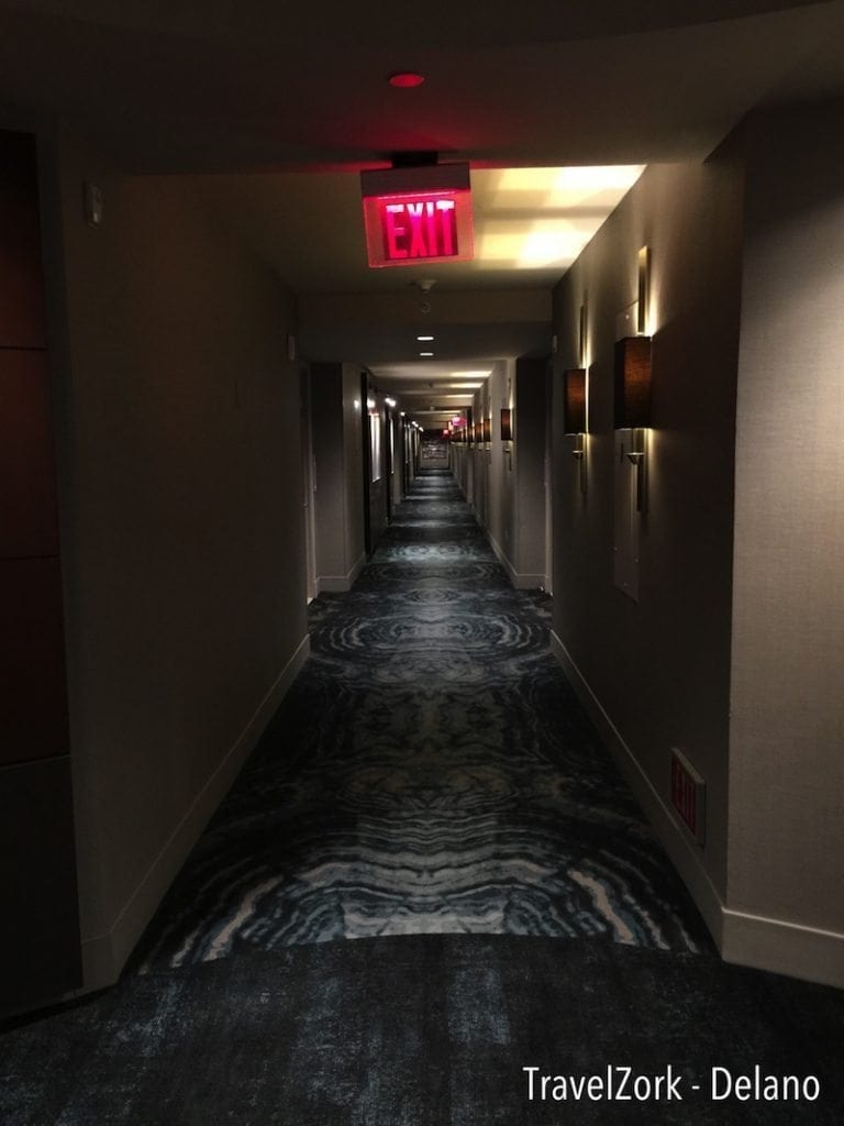
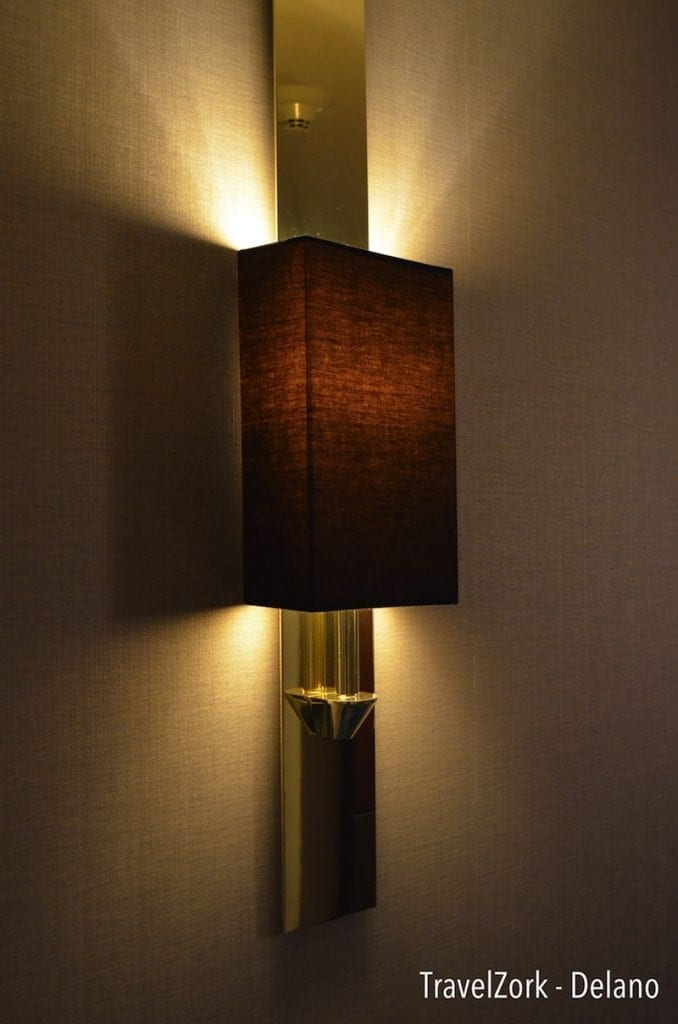
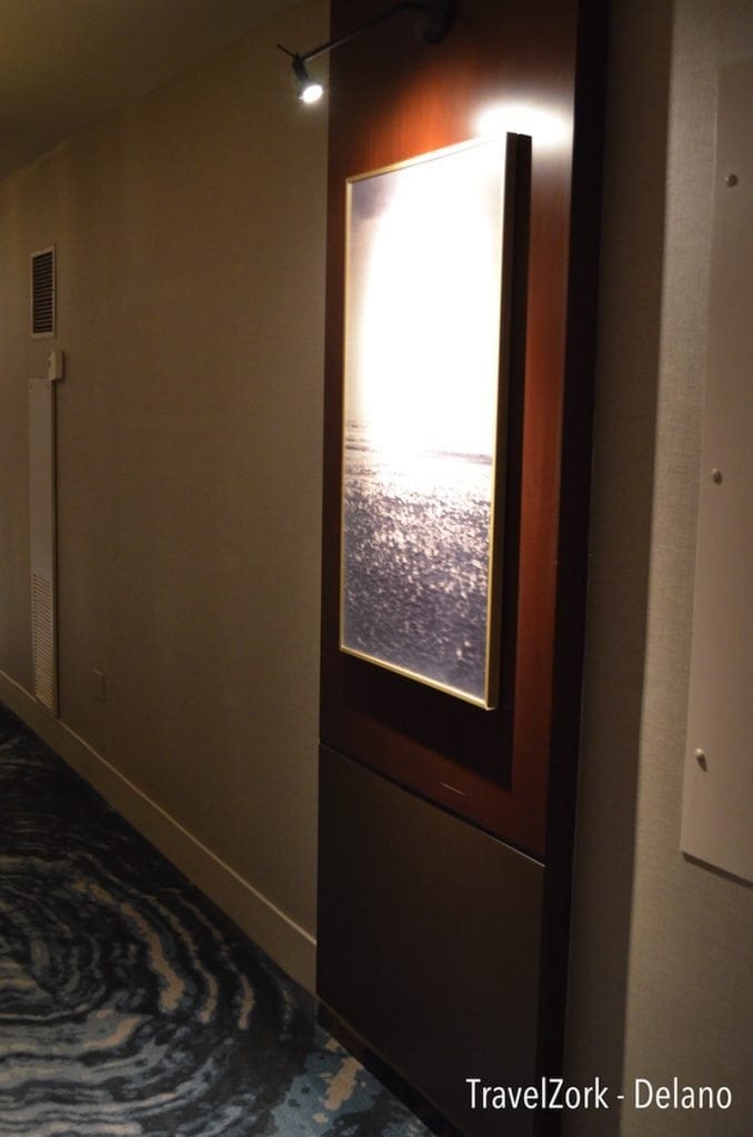
Before we knew it we were off the elevator again on the 29th floor. The tower itself is shaped like an L, with the elevator lobby at the center and a round vestibule just off leading down the two hallways of the floor. The inner side of the L faces up strip, the outer faces away. The lobby is warm, feeling much the same as the lobby in design, leading into lighter hallways with cool toned carpet accenting the earthy walls and brown shaded light fixtures, asymmetrical to art dotted between the rooms. Housekeeping staff we encountered were friendly and courteous, evidence that the Delano is trying to make a mark for itself with guest service.
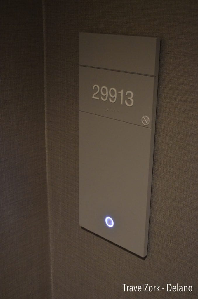
Just down the hall we arrive at 29913, our room for the night. A wave of the key fob, that familiar click, and all at once my excitement builds to see if the Delano really does shine beyond the surface. And at this point, I will say that my bet is placed. Did I win? You’ll have to wait for part II to find out.
Eric loves blackjack, architecture, hotels, more hotels, more blackjack, art and design. He grew up drawing hotels, and now spends his free time traveling to see and experience some of the greatest hospitality experiences in the gaming world while using his education in architecture as a tool to analyze how the best hotels in the world are created and developed.


